
How do you choose a font? Leave the default in? Google the top five fonts for fiction and pick one? Research which fonts are accessible? There are a few basic principles that should be considered before everything else.
Legibility describes how easy to distinguish one letter from the next within the font itself, so for example, if a font uses a single vertical line for a lowercase “L” and an uppercase “i” like Arial does, it can be hard to determine which is which. There are also some fonts that use fancier scripts and unusual shapes for the letters which may be difficult to interpret correctly. Readability comprises the overall ability to continue reading and understanding type, including both the font and how the font is arranged on the page. For the most part, these terms can be used interchangeably and are important to consider in conversation with accessibility. Accessible fonts are a relatively niche area of typographic design that people have started to do significant research on, so if that interests you, check out some of these resources:
Here are a few tips for helping choose a readable font for a long piece of writing:
- Choose one font family or typeface to work within
It might be tempting to choose several different fonts for the main body of your work, but you might end up with too many different options with not enough contrast. Having one level of emphasis (headings, subtitles, main text, footers, and so on) be serifed and another level be sans serif is a common strategy to include some contrast when readability is a major component. If you are perhaps writing a book where characters are speaking to each other in fictional translated languages and you want to indicate a different style for each language, you might want to use a subtle change in font style—making one semi bold, or regular instead of medium—but an entirely different font will feel incredibly jarring. In shorter stories this may not be an issue, but if every few pages a reader has to take a step back and reread, they may put down your book instead of considering your unique type an asset to their experience of the story.
- Use medium or regular versions of a font, not bold, italic, light, and so on.
Many typefaces (or font families) have choices for the specific font that can be used as a default for emphasis, such as light, medium, bold, semi bold, italic, and so on. These font choices are great to subtly add variation for things like slight emphasis or possibly timestamps, but will distract from the content of the text if used too much or for the main text.
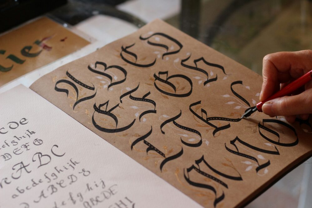
- Use simple serif or sans serif fonts, not flowing scripts or extremely geometric all caps
The goal of a book is to be read, so the typography should not take away from that. While your epistolary novel may feel like it wants a handwritten style for the story, a simple but classic serifed font will be easier to read and convey a similar voice.
- Avoid fonts with inconsistent, very large, or very small spaces between characters
Inconsistent letter spacing that just looks odd is often the result of using a font that was designed with a different writing and lettering system in mind. For example, some default Japanese fonts in the Adobe Suite have a lot of space between “i” and other letters, which looks awkward for most native English readers. Your font should not have too much or too inconsistent kerning or space between letters in order for words to be readable in chunks (like “words are readable” vs. “w or d s a re h a rd to r e a d”). Conversely, a condensed font, especially one that is artificially condensed (i.e. you have manually decreased the kerning or space between characters), can make letters blend together. This happens sometimes with comic book and manga fonts where the word “flick” in all capitals appears to be a swear word, for example. A more condensed font may need to compensate with a larger point size and/or more space between lines, so it is usually best to not use condensed styles for large sections of text.
Back Matter
Source: The Elements of Style by Robert Bringhurst, 3rd edition.