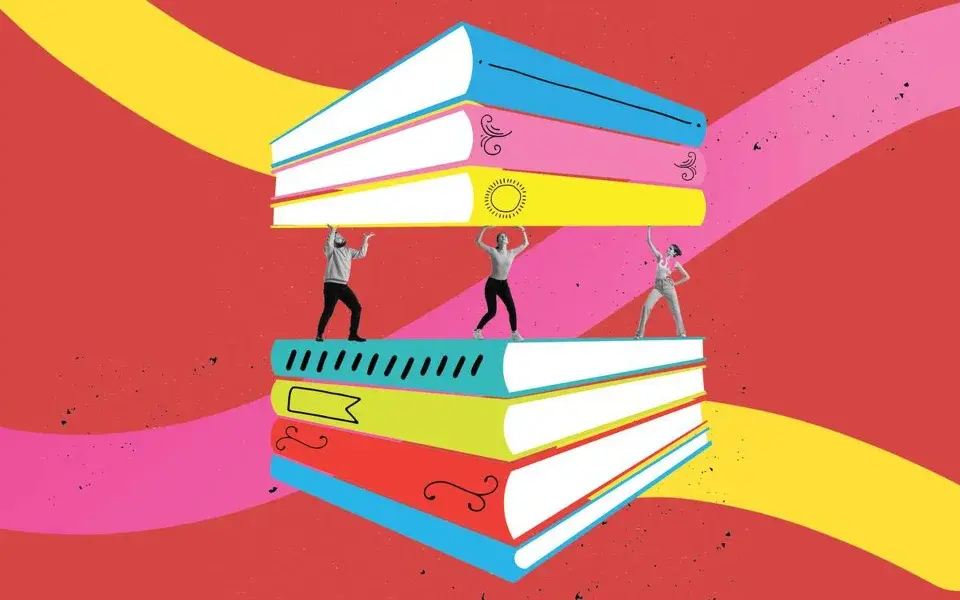
A display of books covers and titles that have the same color blob trend

How Digital Media is Changing Book Covers

Have you recently gone to a bookstore and noticed the majority of the books displayed in the front all resemble similar book cover designs? These clone-like copies are actually very purposeful and mark a new age of book cover designs.

As much as we hate to admit it, judging a book by its cover has become a necessity. Whether it’s a spine wedged between others on a bookshelf, a purposefully staged book at the front of a bookstore, or a thumbnail on the Amazon website, we all do it and publishing companies and designers make sure we keep doing it.

One popular trend that’s been on the rise in 2022 and 2023 is the “color blobs” and minimal line art. For reference, look up book titles like Normal People by Sally Rooney or The Vanishing Half by Britt Bennett. These books and many more upcoming novels are following this trend of big and bold typeface, simplistic and minimalistic art, and bright colors.

One reason we can point to for this infectious trend is the age of digital media. According to an article in The Guardian, is that most people are looking at books at the size of a phone or smaller due to social media and ebooks. Social media, especially, is a beast of its own and is heavily saturated with a plethora of content that people scroll through at a constant rate. Therefore, images and posts have to be eye-catching; they have to immediately reel people in in order to surface from the ocean of content. Designers and publishers have to be competitive when making their social media posts because they want their books to sell opposed to their competitors.

So why the color blobs? In an article in The Week, Jeva Lange explains that these blobs are “alluring” as well as vague enough so the reader can make their own depictions and fill in the outlines of a face or the crude drawings of a woman. In other words, publishers are starting to realize that people don’t have time to sit and ponder what an art piece means on the cover of a book, they just want to be dazzled enough to pick it up and buy it.

However, just like any trend, it can fall victim to burnout. Looking at the “instagrammable” book covers on the Penguin Random House website, we can see just how similar these books look when paired side by side; it’s almost unfeasible to tell the books apart. Which leads us to question if publishers and book designers should follow the progression of digital media and its fads or strain to differentiate book covers? It’s a tough conundrum since book companies don’t want to be left behind when the train of digital media is traveling like bullets, but they also don’t want their books to get lost in the pile of books that are starting to meld together like actual blobs.

Some books that I think find a happy medium between the two spectrums are titles like, Song of Achilles and Circe by Madeline Miller. These books follow the same formula of bold typeface and bold, bright colors, but Miller has created her own distinguishable style with the gold overlay that pops out on each of her books as well as the continuity of the grecian style. Maybe adding subtle signs and symbols of identification can help books stage themselves without falling victim to trends and fads.

Ooligan’s Archive: The Hidden Final Step of Publishing a Book

Publication day has finally arrived. Our project teams, managers, and department leads have spent the last twelve to twenty-four months shepherding your book through all the critical processes necessary to turn a manuscript into the product readers pick up off the shelf. The book has been edited, proofread, designed, marketed, posted about on social media, and submitted for awards. Onto the next project, right?

Not quite.

Welcome to the hidden final step of publishing a book: the archive! If you’re an author, you can probably relate to the feeling of having forty slightly different drafts of the same manuscript on your computer, all with the promise of ‘final final FINAL’ version tacked onto the end of the file name. It’s no different here at Ooligan. In fact, we have an entire shared drive full of a book project’s various components in all their original, edited, proofread, edited again, and finally finished forms. In 2022, a few brave Ooligan students worked closely with our publisher to formalize the process of preserving files in a way that was organized and easy to browse. This led to the archive checklist, a way to ensure we had all the materials we needed to keep a book project accessible after publication.

Ideally, archiving takes place within a month of publication so that all the project team members are still around to furnish the necessary documents. This is more important nowadays than ever before because of policies Google enforces for file storage. If a student graduates and lets their account go inactive, Google will begin to delete content from accounts that have been inactive for two years. For Ooligan, the consequence can be losing years of institutional knowledge and project materials.

To get a sense of the enormity of Ooligan’s archival process, let’s take a peek at how we go about archiving the design files. These materials are the most difficult to replace and often the first files we try to collect. A book has much more than just the cover and text files. There’s the files we send to the printer, the files we upload for print on demand, and the files for the advance reader copies. The front cover alone is saved in several different formats: print-optimized, web-optimized, and two different high-resolution versions. The same can be said of the full jacket files. We also have to consider any images or assets that went into the creation of the cover or interior. For example, the font on the cover of Love, Dance & Egg Rolls was created by the designer, so we archived the font files with the cover files. When the design portion of the archive is populated, you end up with something like twenty different files in three different folders. And of course, you need the original packaged file in case you need to make any changes, from correcting typos in the text to adding a blurb or award information to the front cover.

The other reason it’s important to start with design files is to get them out of the design drive, which is often stuffed to capacity because design files are so large. Our design managers are constantly fighting to stretch that 1 percent of available megabytes left in their drive before Google’s threats win out and we aren’t able to create or save new files at all.

When I took over as the Operations Publisher’s Assistant, I had no idea how much time I would spend acting as a detective, tracking down missing files. It’s at times tedious and overwhelming, but a necessary part of our process. Archiving as a practice preserves and honors the hard work we put into publishing books at Ooligan. It allows us to stay connected with our history, our challenges, and our triumphs. But it also guides how we move forward, serving as a foundation for us to continually investigate and improve our processes.

photo of a full bookshelf with white arched box reading "Inside Ooligan Press:". Centered white box with Ooligan fishhook logo. White text bar across bottom reading "Book Branding Design"

Creating a Book Branding Design Guide: Why and How

A section of Amazon book pages has been catching my eye lately. Authors and publishers have recently been getting creative with the “From the Publisher” section—taking advantage of the space to post some beautifully designed blurbs and headlines.

When I first noticed it, I immediately thought about how similarly designed blurbs would look in a social media campaign, or how elements from the designs could cohere a book’s tipsheets, press release, and other materials. As it happens, other managers at Ooligan had been thinking similarly.

At Ooligan, everyone is a designer, editor, proofreader, marketer, and publicity specialist. So, our efforts, while always noble, are not always cohesive and streamlined. Some book project teams have had beautifully designed social media campaigns (Short, Vigorous Roots and Court of Venom
are recent examples), others have had lovely designed tipsheets, press releases, and other marketing and publicity materials. But it varies, depending on the design interest and experience of each team. How can the design department support all project teams and cohere their design efforts?

A book branding design guide! Each book project team could use a design guide to help make each title’s marketing and publicity efforts easily recognizable, to help define and convey each book’s voice, and to help designers learn to work with design principles and implement brand guidelines—useful skills to have beyond our time at Ooligan.

I have worked with brand guides before in other organizations, dutifully following the guidelines for typography, color, logos, and aspect ratios. But I had never built one and wasn’t sure where to begin. Book marketing is about making people aware of the books they want to read but don’t yet know exist. Who wants to know about this particular book, and what do they need to know about it? And, how do we best speak to them? What is the distilled essence of this book? What makes it special? How can we convey that visually?

I turned to Adobe for help getting started, modifying their advice to better fit with our specific mission. The following elements form the new basic book branding brief for each title.

Color

I began by creating a color palette based on the book cover’s background color, plus a lighter and darker version, adding secondary colors that matched the tone of the book, hoping to keep our cohesiveness from becoming stale and to offer designers a little flexibility. I found through trial and error that an exact match to the cover materials is not as important as conveying the right mood, and made slight modifications to the color swatches used in the covers, including each color’s HEX values for consistency.

Typography

Selecting type was more complicated. At Ooligan, we use Adobe Creative Suite programs to design our books, along with the fonts Adobe provides us license for. But most designers in the press don’t have their own full-time access to the software, and many prefer to use Canva. Fortunately, Canva has loads of fonts available for free, and so we were able to choose some similar to what the book designers had used, selecting fonts for headlines and body text that complemented each other and matched the aesthetic of the book cover and content.

Images

We often go to Pixabay, Unsplash, and Pexels for images. Sometimes our books will have some of their own graphic elements to incorporate into our marketing and publicity campaigns. Canva also has quite a few little graphic elements available for free use. We put together a document with some photographs, png files, and Canva graphics for designers to use when creating their posts and documents.

Templates

The project managers can use the above elements to make templates in Canva for their team to use for the various social media dimension requirements, as well as blurbs and quotes for them to feature or incorporate into their designs. These design elements can also be used later in creating other marketing and publicly collateral.

Ooligan is a teaching press, and we are all learning every day. I see this new design process as an iterative one; we are already constantly adjusting what works and what doesn’t, and will do so with each new title. The team for The Keepers of Aris by Autumn Green, our next title to be published, has been busy designing away in preparation for their upcoming social media campaign and book launch. I look forward to seeing their designs!

photo of a full bookshelf, white arc band with text "Inside Ooligan Press", white square with Ooligan fishhook logo, white bar across bottom with text "Good Golly, a Galley!"

Good Golly, A Galley!

Prior to starting at Ooligan Press, the term “galley” applied to art and boats. I’ve since learned what a galley is and its importance in the book publishing industry.

A galley is an unfinalized advanced reader copy of a book that, unlike the final product, typically uses the manuscript prior to the final proofread. Before the galley is produced, the manuscript goes through developmental edits and copyedits to the point of practically perfect. Occasionally, the galley is made using the final draft but never by using any draft before the second to last. Galleys can be in hard copy or electronic form, which may make you wonder: Why even make a galley?

To build an audience! Galleys are sent to book bloggers, reviewers, and even authors in hopes that presale reviews will come in and blurbs will be obtained. Authors are given a portion of the galley proofs and encouraged to distribute them at events and to their fans! Giving away free books, even unfinalized copies, seems counterintuitive, but it’s how to build an audience and create excitement around the book!

Now that you know the what and why behind a galley, we can move on to the how. Once the manuscript is edited to almost perfect it is time to start on the galley. Ooligan Press uses Adobe InDesign to create their galleys, so we will be using InDesign processes to go over the steps.

  1. Open InDesign and create the layout for your galley (remember to have an even number of pages).
  2. Save your work here (continue to do so throughout the process)!
  3. Start creating paragraph types for the title, author, dedication, body, body without indent, chapters, glyphs, and folios.
  4. Create a new parent page (for the front matter), apply it to the first three pages, add folios to the bottom of the page for page numbers and the title/author’s name.
  5. Drop the manuscript into the InDesign document.
  6. Remove the trailing white spaces, multiple return to single return, multiple space to single space, and tabs from the text.
  7. Apply your paragraph styles to the operative places (ex: body paragraph to every paragraph but the first one after a chapter or section break.
  8. Remove folios from any page that starts a chapter. You can do this by applying the “none” parent page.
  9. Go through the manuscript and apply any italics to the text in InDesign, create a character style for each paragraph style this step changes.
  10. Play around with the paragraph styles you created until you’re happy with the overall look (be aware that the some fonts are protected and that you can download fonts from Adobe).
  11. Play around with the margins to fit the ideal amount of lines per page, but keep in mind the binding used and how people hold books.
  12. Confirm that every page has at least five lines, if there is a page with less than five lines change the tracking of a large section of text prior to those lines but do not go over roughly twenty lines.

The above list clearly applies to people with at least some knowledge of how to use InDesign. These are also just the basic steps. Creating a galley seems straightforward but, as the old adage goes, the devil is in the details. In this case the fun is there too! Finding the best fonts for the title, body, and folios, making sure you find fonts that look good together and match the theme of the manuscript, and finding glyphs for the folio, chapter, or section breaks that are unique and relate to the story are the things that make a galley unique and special.

References for galleys and their purposes can be found on Scribe Media and Career Authors.

photo of full bookshelf with Ooligan fishhook logo centered. Arched white text box reads "Inside Ooligan Press" and straight white text box reads "Contracts and More"

Inside Ooligan Press: Your Manuscript is Accepted! Now What?

Note: This is part of the blog series “Inside Ooligan Press”, about how we take a manuscript from an idea to a professionally published book.

So, you wrote a killer query letter and submitted a proper proposal. You won over Acquisitions and we pitched your project to the press successfully, then we offered to publish your book: now what? For the sake of transparency and in an effort to demystify this crazy little thing called publishing, I humbly offer you an inside look at what you can expect when working with Ooligan Press.

Once you get notified that our pitch was successful, we enter into the contract negotiation phase of the process. We are a small, not-for-profit press that generally cannot offer author advances. However, authors are compensated for their work, receiving industry standard royalty rates for trade paperbacks based on cover price and units sold, paid out biannually after publication. The Publisher and author negotiate terms of the contract including dates and deadlines for revisions, the final manuscript and any additional materials, and publication, among other things. This process generally takes about two weeks, give or take, during which time it is encouraged that the author has a trustworthy individual review the contract with them.

Once the contract is signed, we will typically go straight to work with a light or heavy developmental edit, determined by the Acquisitions Editors when we evaluate your manuscript. As a teaching press, we accept manuscripts that are strong and show immense promise, but that offer learning opportunities for the members of the press. This includes the need for editorial work. Expect to do revisions! The Acquisitions Editors lead a team of editors in reading and analyzing your manuscript to determine what is working and what needs work based on our knowledge and experience. We craft an editorial letter full of our critiques, compliments, and suggestions for revision and deliver it to the author for review. We follow up with a phone call or video chat to discuss the letter if the author feels it would be beneficial to do so. The DE process takes about a month, sometimes more. Then the author gets to work on revisions, for which they also get about a month to complete, though timelines may vary based on the project.

During development, your title may change. Sometimes it is necessary to tweak the title, or change it altogether, but not always. Acquisitions Editors must consider best practices for title generation and consider whether yours is appropriate for the genre and market, the literal and connotative meaning of the words or phrases used, and whether it encapsulates or represents the content found within the book. If we feel a change is necessary, we provide the author some alternative titles to consider and deliver them with the editorial letter. While the author’s input is taken into account, the final title is decided upon by the editors.

While we are hard at work developmentally editing your manuscript, you will be completing Ooligan’s Author Questionnaire: a document that will be used by all departments to produce and promote your book. While this questionnaire is lengthy and can feel slightly invasive, the author can of course choose which questions they will and will not answer depending on their comfort level.

Upon delivery of the revised manuscript and questionnaire, the author is then introduced to their Project Manager: the person who will see the project through the rest of the way. They are responsible for keeping the production of your book on track and are your primary point of contact for questions and concerns after acquisition and development.

Your manuscript will undergo copyediting by a team of editors, led by Ooligan’s Managing Editor. Depending on the needs of your manuscript, this may be a light, medium, or heavy copyedit. We use The Chicago Manual of Style as our primary style guide. This process may take one to two months depending on the time of year and the current stages our other titles are in. The author then receives the edited manuscript and reviews and implements the editorial suggestions, for which they typically get a month to complete.

While these editorial processes take place, your book’s dedicated project team, led by your Project Manager, has already begun their work crafting the sales hook, back cover copy, and so much more. They work with the managers of each department, Acquisitions, Editing, DEI, Digital, Design, Marketing, Publicity, and Social Media, to create a master plan to produce a quality book and launch it into the world. But wait, there’s more.

Be sure to check out future installments of this blog for a look at more stages of the production and promotion process at Ooligan Press!

woman wearing glasses at computer

Why Would You Want To Work For Someone Else’s Publishing Company?

With an ongoing global pandemic, it is no surprise that many individuals are looking into options that allow them to work from home. In the publishing industry, freelancers are common and many publishing companies even contract freelancers for specific projects or needs. With the added appeal of making your own schedule and essentially managing your own business, why wouldn’t you want to be your own boss?

Employees who are hired as full-time workers of publishing companies usually have several benefits in doing so. For many individuals, the structure and financial security of the nine-to-five office job is preferred; not to mention, many of these jobs allow for health insurance, paid time off, matching retirement plans, and so forth. These employees are often paid hourly or salaried pay and don’t have to deal with the added responsibility of keeping track of and withholding their own taxes from their income. While freelancers do have the option of hiring an accountant or bookkeeper to keep track of that side of the business, working for a company has that built in the structure of the business already.

Even with all the benefits of working for an already established publishing company, according to a blog from Udacy (a technological career training site): Statista data projects that in 2027, 86.5 million Americans will be freelancing and be 50.9 percent of the total workforce. The draw is not only due to individuals and companies pivoting due to the COVID-19 demands that began in early 2020. That same Udacy blog states that the numbers have been steadily increasing over the past decade or so. For many, a huge draw is being able to be in control of their own work/life balance. There is, no doubt, a level of freedom that comes with which clients and projects you take on, how many you take, what kind of work you take on, when you are able to schedule appoints—both personal and professional, when and where you work, and generally being able to call the shots on your career and professional life.

While it does take a lot of “behind-the-scenes” work to network and find the work and the clients in order to sustain your financial needs and make ends meet, many individuals are drawn to the challenge and the desire to learn all aspects of what is essentially running their own business. Many business and entrepreneurial start-ups happen as a result of freelancers who start with the vision of what they want their careers to look like and build from there.

When it comes down to a decision as to whether or not freelance work is right for you, it truly varies from person to person. Take stock of your career goals, look at what you want out of life and what is important to you. Many individuals are able to do some combination of contracted, employed, and/or freelance work. If you are wanting to do a bit of both, just make sure to check with your employer to make sure that any of the projects you take on are not considered a conflict of interest. Otherwise, do what works best for you and your work/life balance and professional development.

Spines 101: Why Book People Should Care About Ergonomics

Today’s consumers crave to feel understood, and that includes readers. Although the romantic image of Elizabeth Bennet with her back against a tree, bent gracefully over her favorite book, may be what we all hope we look like when we’re reading, the reality is more likely to include a) a contorted body in an armchair, b) a desk and a head leaning heavily forward on one hand while the other hand maintains pressure on the open book, or c) some version of reading in bed, where way too many muscles are unconsciously engaged. Whatever your usual reading position, you have likely experienced the feeling of frustration accompanied by the thought, I’ve been reading in this terrible position for two hours and am fairly sure I now need physical therapy. Most often, pain develops in the cervical spine, which is the place—like the spine of your book—holding everything together. How can we promote a positive book culture when reading is associated with a negative physical experience?

Assuming the publishing world were to accept responsibility for leading the movement in ergonomic reading solutions to save spines everywhere, a few points need addressing. First, we need to be aware of what the field of ergonomics looks like today. Ergonomics in the workplace and home offices, as well as in mattress and pillow design for sleeping, have dominated the conversation thus far. Second, we should identify the relevant tips and products that could be useful for readers. Although this may seem obvious, readers are unlikely to think they are doing harm to their spines unless they become the targeted audience. Third, we must innovate. We need to work for the reader in the design department. My focus is on the neck pain that 13 percent of Americans are experiencing right now (according to my main resource for this post, a blog by physicians called Spine-health). Other health concerns connected with reading for long periods of time, whether in print or digital format, include eye fatigue, insufficient blood flow, and improper breathing. By recognizing these issues and addressing them to the best of our ability, we can ensure reading moves into the future as a healthy activity.

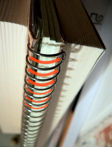
Design solutions to neck pain associated with reading range from prioritizing reader comfort and accessibility in regular decision-making to creating brand-new product features, digital services, and partnerships that support the reader. Is the book wide enough to be held open without strain? Would a spiral-bind or Coptic stitch binding allow the book to lie flatter? To give advice on reading positions, could publishers create a free insert or digital tool connected with the sale of their books? The question I want to highlight, however, is this: Is the text readable from a healthy distance? In this area, ebooks hold an advantage with the option of increasing text size. Printed books should be designed with readability in mind for all, rather than just printing extra-large text versions that can cause embarrassment. This simple solution could allow readers to prop their books up at eye-level, on their knees, their dog, a pile of pillows, an angled desk, or, gasp, a reading stand. While the world has been shocked by the effects of “text neck” on our youth, the unhealthy habit of flexing the neck forward to read and respond to messages on a cell phone, avid readers have been dealing with the same condition for centuries. (Seriously, check out Nature’s Potent Methods, circa 1899, page 538). Watch the Spine-health video describing the effects of text neck, and you’ll understand why it’s preferable to keep just one bowling ball balanced over your shoulders.

Publishers need to make themselves experts on the reader in order to stay in competition with Amazon, other used booksellers, and all the free material available on the web. We cannot ignore the physical condition and habits of the reader. Showing people we know what issues make it difficult to read as much as they would like, then providing advice and design solutions, will help readers to feel good about investing in businesses that put their interests first.