
The biggest and best revelation of my time at Ooligan Press so far has been how much I love working on book interiors. Covers are kind of the show horse of book design—the public face of a title and the first thing most people see when they look at it—but I think working on interiors is like putting together a fun little puzzle. You get to take the raw materials, figure out how everything fits together, and make something pretty cool. Perhaps you are like me (a nerd), and already enjoy spending your Saturday nights at home kerning, but for everyone else here is a (very) basic rundown of what we think about when we think about designing books:
- Trim size: We can tell a lot about a book from its size. We expect novels to be a certain size that is portable but not insignificant (usually around 8.5″ x 5.5″). But maybe you’re working on an art book, which needs to be large enough to allow for high-resolution photographs. Or maybe you’re working on a cookbook, which needs to be large enough to lay open without the reader having to hold the pages down with their sauce-covered fingers.
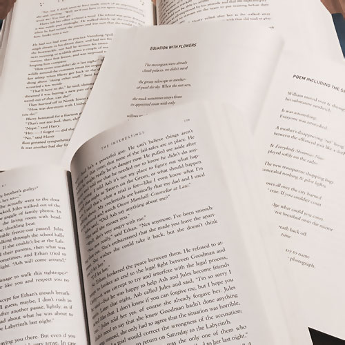
- Text block and margins: The text block is the actual space the words take up on the page, and the margins are the white space around the text block, but you probably already knew that. The way your margins and text block interact can affect the feel of your book a lot. Ooligan Press strives to meet the standards of the Green Press Initiative, so we design our books with an eye towards minimizing page counts and ink use, but it’s still important to leave some white space on the page to let the design breathe and give the reader a place to put their thumbs.
- Folios, running headers, running footers, and so on: Once you’ve figured out how to treat the main text of your book, you’ll need to deal with everything else. Where are your page numbers going? Are you going to run the chapter or section title at the top of the page to help orient your reader within the text? Is it a reference book that needs tabs or some other system to help readers find their place quickly?
- Typography: I could write a whole book on the history and use of fonts (and several people already have), but for now I’ll just say that the right typeface is integral to a successful design. Yours should include all the characters and weights that your book requires, be easily readable in large doses (so maybe don’t lay out an entire book in Llama font), and fit the feel of your manuscript. (I like Baskerville a lot, but an eighteenth-century English transitional serif might not be the best choice for, say, a post-apocalyptic YA novel set in North America during the twenty-third century.) There are, of course, some faces that the industry as a whole has decided work especially well, and if you start keeping an eye out for them, you’ll see these same fonts pop up again and again.
Book design is a whole world unto itself, and a thorough rundown would take more time than we have here. At the end of the day, however, our job as designers is to facilitate the transmission of information in a way that is both easy and enjoyable, and these are just some of the tools that help us do it successfully.