
Ask a designer for the best book on typography and you’ll probably get a one-word answer:
“Bringhurst.”
It’s not that there aren’t other good ones out there, but this is where to begin. “Bringhurst” is short for The Elements of Typographic Style by Robert Bringhurst. I expected to like it, but I didn’t expect it to be so well written. Credit the man who studied philosophy, linguistics, and poetry, and who started a press in order to publish his own poetry chapbooks. Eventually he was hired to run a print shop in Vancouver, B.C., for Hartley & Marks.
This was the ’80s, and desktop publishing was just starting to take off. Bringhurst felt the sudden availability of digital fonts would overwhelm any inclination toward rational design and cause typographical chaos. He did what any perfectionist would do: write a book.
The Elements of Typographic Style is a guide to the history and artistry of letterforms. It’s not a book of rigid rules, and Bringhurst isn’t stuck in the past. He can explain why a font acts differently on the page and on the computer screen: “The underlying problem is that the screen mimics the sky instead of the earth,” he says. “It bombards the eye with light instead of waiting to repay the gift of vision.”
For me, Bringhurst is a gift every day. It shouldn’t be a surprise that the book is beautifully designed; the text is set in Minion Pro by Robert Slimbach, captions in Scala Sans by Martin Majoor. It’s a joy not only to read but to look at, but I sure hope I’m not looking the final edition. Hartley & Marks keeps it in print, but their list is down to two—this and a book on Japanese joinery.
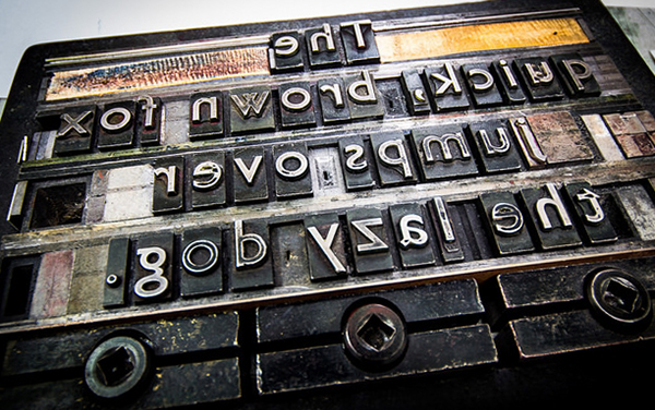
Simon Garfield takes a lighter approach to typography in Just My Type. It’s fun and informative, written for the general reader and not as an antidote to chaos. In fact, it’s full of stories about fonts gone wrong (Comic Sans), font piracy (Baskerville rip-offs), and the origin of “The quick brown fox jumps over the lazy dog” (a pangram, a phrase with all the letters of the alphabet).
Garfield dives deep into font history, too, and devotes a few chapters to some pervasive and perverse font families. I learned there’s science behind road sign typography, the best of which has been designed from the perspective of the driver.
I have to say, it’s odd to read a book about design that isn’t well designed. The main chapters are set in Sabon Lt Std, a fine serif font by Jan Tschichold, but it looks too big for the page. These are interspersed with “Font Breaks” set mostly in Univers 45 Light, a fine enough sans serif by Adrian Frutiger, and sprinkled with other fonts as examples. It takes good page design to make it all work.
For that, there’s Richard Hendel’s book, Aspects of Contemporary Book Design. This one is full of essays by and interviews with some top book and type designers who describe their projects in great detail with illustrations. Kent Lew describes how he designed the Whitman typeface, crediting a 1939 design called Caledonia by W. A. Dwiggins for inspiration, and comparing it to Joanna, a typeface designed by creepy genius Eric Gill.
All these designers let us in on their creative styles and processes. One of them is Abbey Gaterud, our own publisher of Ooligan Press and instructor of typography and book design. Abbey makes a clear case for book designers to understand the workflows for both print and digital. Beyond file compatibility, it’s about doing whatever you can to make digital files as stable as possible for the future.
The text for Aspects of Contemporary Book Designis set in Arnhem by Fred Smeijers with captions in Klavika by Eric Olson. Arnhem and Klavika are too recent to be included in Bringhurst. That’s why we’re going to need a new edition someday—to prevent all types of chaos.