In my previous Manager Monday post, I sang the praises of proofreading—an important yet often undervalued skill in the complex web of the editorial process. For many aspiring freelance editors, proofreading is the best (and in some cases, the only) way to get a foot in the door. But what are proofreaders actually looking for?
Whereas copyeditors focus on grammar, spelling, wordiness, clarity, redundancy, and other aspects of the text itself, proofreaders search for and identify errors introduced during the design process. Quite literally, they’re reading the proofs—the typeset pages—to make sure everything is formatted correctly. Back in the days when each letter of type was set by hand, there were plenty of opportunities for mistakes to be introduced, but modern book designers use software such as InDesign and import the text directly. It’s less likely a proofreader will find errors introduced by imperfect humans and more likely a proofreader will find errors introduced by imperfect machines.
While proofreading The Widmer Way and Breaking Cadence, the most common errors we found were bad breaks, word stacks, inconsistencies in formatting, and small typos that slipped through the previous editing rounds. (Normally, proofreaders would also keep an eye out for runts, widows, and orphans, but Ooligan’s designers are so good that they fixed all of those before sending the proofs to the editorial department.)
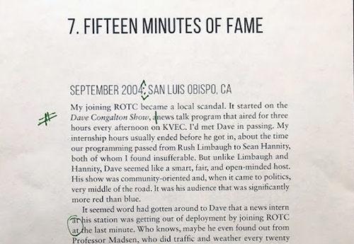
Bad breaks: Bad breaks are one of those things that you can’t stop seeing once you know what to look for. A bad break refers to end-of-line hyphenation where a word “breaks” onto another line where it shouldn’t, such as in The Widmer Way, where the word “brewhouse” broke as “bre-whouse.” The break made the line difficult to read because it broke the word into two nonsense syllables. The Chicago Manual of Style recommends following Merriam-Webster’s syllabication for breaking words (i.e., “publishing” could break as either “pub-lishing” or “publish-ing”). Bad breaks also commonly occur in hyphenated phrases, such as “great-grandmother.” Design software will see no problem in adding another hyphen between “grand” and “mother,” turning it into “great-grand-mother,” but if possible, it’s better to break at the hard hyphen between “great” and “grand.” Some publishers also avoid breaking words that come immediately before or after an em dash, such as “—pub-lishing” or “publish-ing—”. To indicate a bad break while handmarking a proof, circle the break and write “BB” in the margin.
Word stacks: Stacks occur when the same word (or words) appear “stacked” on two or more lines. They most often occur at the very beginning or end of a line of text, but they can also appear in the middle of a paragraph. Stacks are sometimes unavoidable, and in some cases, leaving them alone might be preferable, as “fixing” them might negatively alter other lines by creating text that is too loosely or tightly spaced. To mark a stack, just circle the offending words.
Inconsistencies in formatting: The Widmer Way has a lot of italics throughout, and Ooligan’s design process makes it easy for italic and boldface fonts to get lost. In conducting our proofreads for both Widmer and Breaking Cadence, we checked the final Word document against the design proofs to make sure italics appeared where they needed to. To flag problems with a font face, underline the section that is incorrect and write “ital” (for italics), “bf” (for boldface), or “rom” (for roman, neither bold nor italic) in the margin.
Things we missed during earlier rounds: This includes everything from typos to factual errors, such as a sentence in Widmer that misidentified a building as having been constructed during a period of growth for a city, when in fact, the city in question had ceased to formally exist by the time the building was built.
I hope this short guide helps illustrate some of the most common errors a proofreader may encounter. Knowing about stacks and bad breaks certainly would have helped me with my first freelance proofreading project!

