
At Ooligan Press, we have two main stages in the publishing process that involve creating interior layouts for print books (not EPUBs): the galley and the final book interior. For our title Cekpa (launched in November of 2025), I had the opportunity to design both versions of the interior, and they were different processes. I wanted to take a moment to demystify what goes into each.
What is a Galley?
Although I’ve seen some variations, a galley at Ooligan is a version of the book that gets sent to authors for blurbs almost a full year ahead of publication. It is often shared with blurbers as a PDF using a website called Edelweiss. Because the galley is made so early in the process, it won’t have as much design finesse, and hasn’t gone through the final rounds of proofreading.
What is a Full Book Interior?
A full book interior is exactly what it sounds like: the interior of the book as it will be printed and distributed—how it will appear to anyone reading a physical copy.
What are the Differences in the Design Processes?
One of the biggest differences is the timeline. For the galley, I had about two weeks to create the galley, and then a few rounds of feedback and revisions.
For the full book interior, the process takes about five months and has more stages: font samples (and feedback), author feedback, the first full interior draft, feedback and revision, receiving and implementing the proofreads from Editorial and the author, and finally, final revisions.
What Are the Font Considerations for Galleys vs. Full Interiors?
For the galley, I was given free rein over font choice. I wanted to try something a little different than the standards we always use in design classes. In fact, I knew even when I read Cekpa when I was on the book’s project team (before I knew I’d be designing anything for it) that if I did ever design it, I wanted to use Sabon. Sabon has a personality and warmth to it while still reading as a standard font that wouldn’t call attention to itself or look unusual in any way.
At the time the galley interior was created, Cekpa didn’t have a cover design yet so I couldn’t match cover fonts. And so, the half-title and title page, as well as the chapter titles, don’t match the cover at all.
For the full interior, my first job was to make font mockups in order to play around with different body text fonts and title fonts. By this time we had a cover, so all my title font options were derived from the cover fonts (or similar ones, since some of the cover fonts didn’t have lowercase letters). I also experimented with the placement of running heads (the author, book title, or chapter titles typically—but not always—in the top margin) and folios (the page numbers) and where on the page the chapters started.
This time around I didn’t use Sabon because it was limited in weights and styles, and I knew we would need something with more versatility. After turning in the samples to our design manager and publisher, I got feedback on which fonts and placements we would use going forward.
What Goes Into a Full Interior Design that Doesn’t Go Into a Galley?
Because the galley is much simpler in scope, it doesn’t get a ton of design attention. The full interior gets a lot more. For one, the front matter and back matter are much more extensive, which adds to what needs to be designed. In addition, the full interior has to be rid of widows (when the last line of a paragraph ends up alone at the top of a page), orphans (when the first line of a paragraph ends up alone at the bottom of a page), and runts (when a paragraph ends with one lone word, especially a short one, in its last line). The full interior also got a more specialized dinkus (the glyph or image used to signify section breaks) and chapter opener ornamentation that the author suggested.
Which is More Fun?
As with most things, this will likely vary by person. The galley is easier and quicker, and now that we have printed galleys (pictured with this post) it’s pretty thrilling to look inside and see the text and chapter headings and margins and know you designed it. For me, though, it’s the full interior. You get to spend a lot more time with it and make it look nicer, cleaner, and pay attention to all its details.
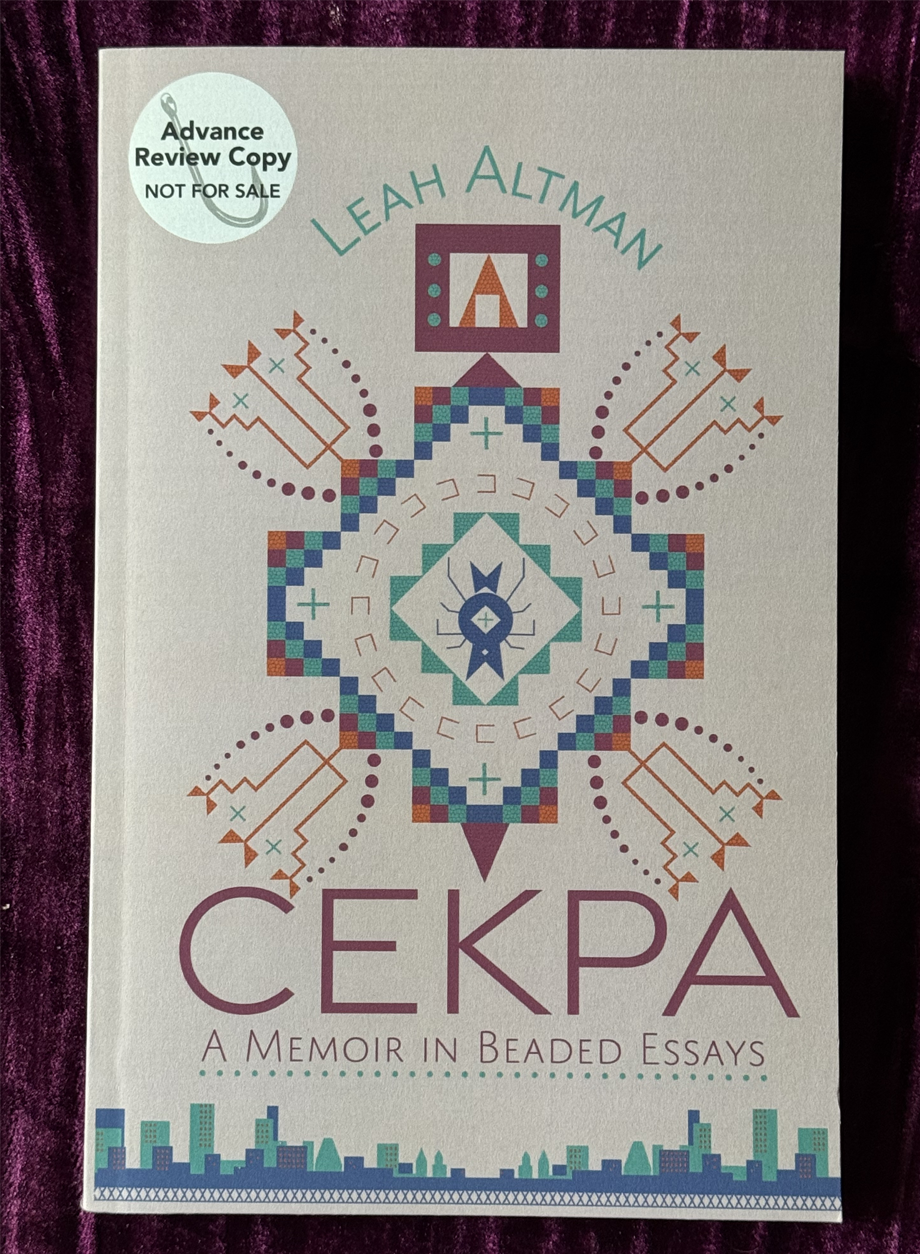
Cekpa galley designed by Alexandra Devon.