
Every time someone says “don’t judge a book by its cover,” I cringe. This clichéd phrase implies that the cover of the book is useless in discerning what the book is about and that the cover has no other use than to “cover up” the pages within. The phrase was quite popular in my youth, and I recall being reprimanded by friends any time I turned down a book because I thought the cover was subpar. For years I felt guilty about being so judgmental—until a classmate introduced me to the work of Graphic Designer Chip Kidd.
My first exposure to this curious man was in a video of his TED talk from 2012, titled “The Hilarious Art of Book Design.” In the talk, he speaks about the purpose of book cover design and its importance to the artifact as a whole. Kidd tells the audience, “They [books] all have one thing in common: they all need to look like something … Why? To give you a first impression of what you are about to get into.” One of his first examples is the cover of Me: Stories of My Life by Katharine Hepburn, which he explains is written as if it were a conversation. To reflect the content within the book, he chose to create a cover that was made entirely of typography. With this new knowledge, I picked up a book from my shelf, Commonwealth by Ann Patchett, and examined the cover: three oranges and scattered orange leaves on an unassuming white background. My first thought was that the oranges meant to signify that the book took place in California, perhaps somewhere in Orange County. However, after reading the first chapter, I realized the oranges had another meaning as well; they are the stars of the first chapter, where the party guests are supplied with alcoholic orange drinks, which in turn are the cause of the fateful kiss between Beverly and Bert.
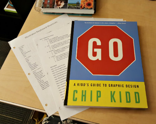
Since watching the video, I have enrolled in the Book Design Software class and was pleased to see a book by Chip Kidd on our list of required materials. Although Go is geared toward children, I have found it quite enlightening. The book goes over the basics of graphic design; it covers techniques such as scale, patterns, and abstract interpretations of ideas versus literal interpretations of ideas, and it introduces readers to typography. Kidd feels that once you have learned the techniques, you will come to see that “ideas come from the world all around you, and you have to try and recognize them.” The last portion of Go is dedicated to design projects that he hopes are “thought-provoking, maybe eye-opening, and hopefully fun.”
When learning from someone like Chip Kidd, it has become painful to hear “don’t judge a book by its cover.” The cover is part of the art and has just as much meaning as the words (or pictures) on the pages within. At last, at the old age of twenty-four, I have learned that I was in the right all along: books were meant to be judged by their covers.