As the new manager for the Ooligan Press website, my team and I have been appointed a task of monumental importance. The work that we do will ultimately end up creating a brand for Ooligan Press, so our work needs to be a genuine representation of our goals and values. Though we are still in the beginning stages of our endeavor, we are excited by what we have accomplished so far.
Our first step was to prioritize the usability goals that were given to us via a collective brainstorming session with members of the press:
- We want our new website to be a stand-alone platform that is managed by members of the press so that there are opportunities to foster learning experiences for students as new content is created and new design ideas arise.
- From a marketing standpoint, we want the website to be image-rich, featuring pictures of people interacting with Ooligan books indoors, outdoors, and in a variety of settings.
- We are first and foremost a press, so we want our books to be a leading feature on the site. We want it to be as easy as possible for people to find and buy our titles.
- We want navigating our site to be an intuitive and user-friendly process.
- We have so much content from our student-created blogs, so they need to be easily accessible so that they stand as testament to the high-quality education that our students receive.
- We want information about our graduate program here at Ooligan to be easily accessible to everyone who visits our site.
Once we knew what we were looking for overall, we honed in on specific details for our navigational aspirations.
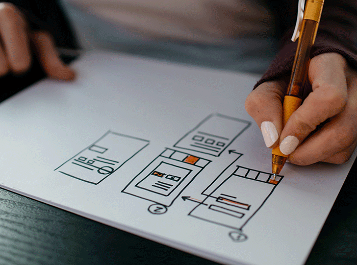
My team decided to use a static navigation bar to house all of the important elements of our website; this means that no matter where you are on the website, the navigation bar remains in place. We quickly decided that the BUY OUR BOOKS button was guaranteed to have a spot on our new navigation bar. Once the site is fully up and running, this button will take customers directly to places where they can shop for our publications. The ABOUT button will also be housed in our navigation bar; our NEWSLETTER button will have a place here as well, but it will also be located at the bottom of the site in the footer so there will be no doubt that we want our customers to subscribe to our newsletters. Ooligan’s awards, accolades, statements, history, and submission requirements will also be up front and easy to find. A very important DONATION button and a SEARCH box are the final components that will be included within the static navigation bar. A scrolling slideshow will be inserted under the navigation bar as a way to showcase our upcoming events and recent releases.
Once these goals were established, the team set to work finding comparable sites that featured some of the elements we were looking for. We combed the internet and found examples of things that we loved and things that we felt our site needed so that we could present our ideas to the press.
Then we focused on branding the site. Not that long ago the Ooligan logo was redone, and it goes beautifully with the PNW theme that we wanted our new site to have. Using the logo as a starting point, we brainstormed color palettes that would complement our lovely Ooligan Press fish hook. We drew on both urban and rural influences and came up with four different color schemes to present to the press.
Our next step is to get feedback from our colleagues. At this time, I am still in the process of collecting that feedback so that my team and I have a better understanding of what direction we should take and what our next steps will be. Once we have the information we need, the smaller design pieces will quickly fall into place. We will decide on typefaces and graphic elements, as well as what pictures will work best with our new brand. We will then present our ideas to the press for a final time, and the voice of the press will have one more say. Our ideas for the website continue to evolve, but they are becoming more concrete with each step, and we are looking forward to the final reveal.

