Choosing a Readable Font
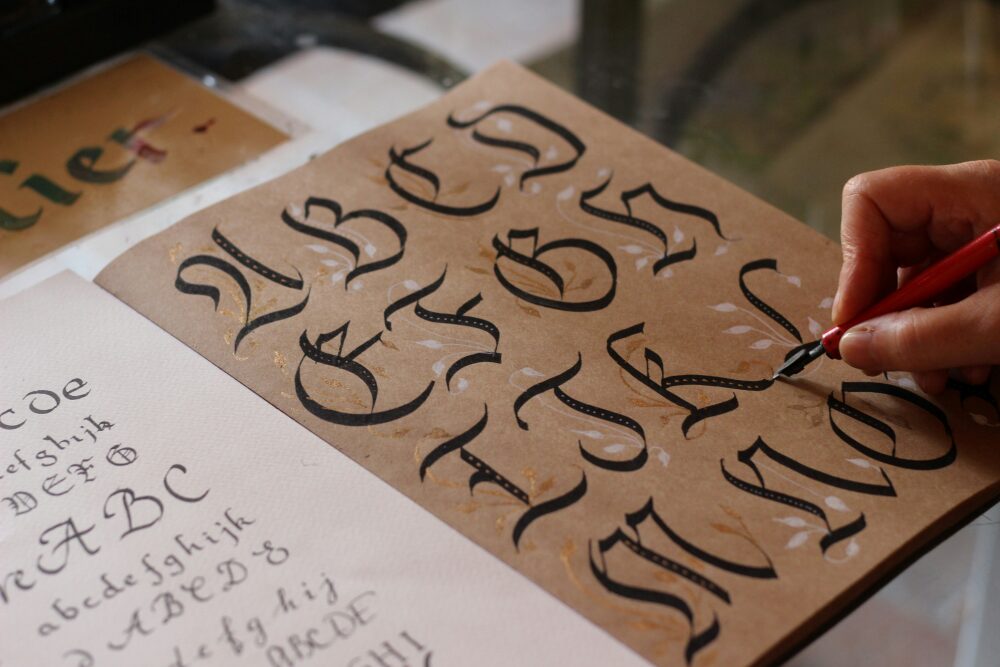
How do you choose a font? Leave the default in? Google the top five fonts for fiction and pick one? Research which fonts are accessible? There are a few basic principles that should be considered before everything else.
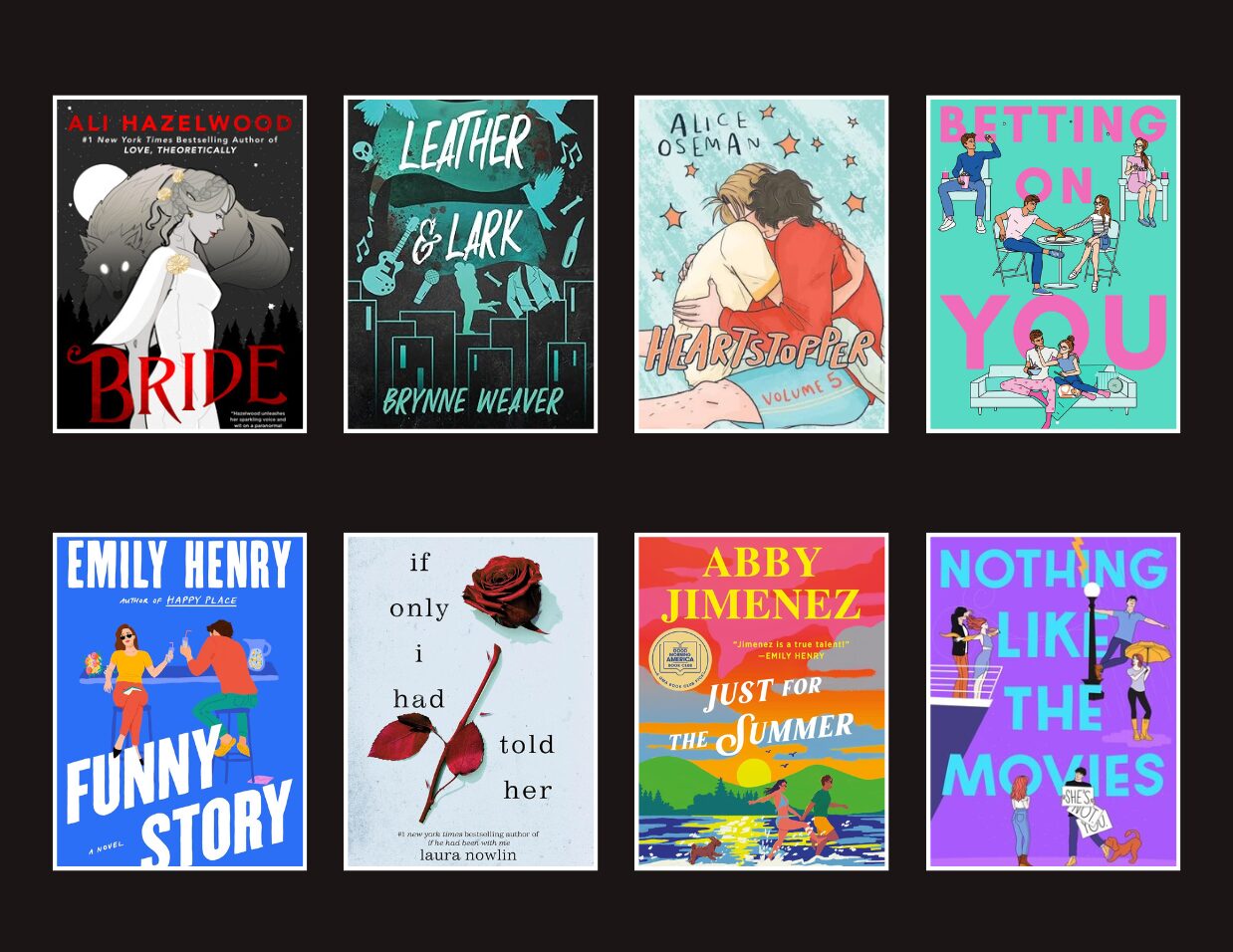
The continued shift toward illustrated covers appeals to a younger audience, emulating the popularity of the same trend in YA, causing confusion and misinterpretation of the intended audience for these books. This is a concerning failure to match content with audiences as social media such as BookTok picks up adult romance books, including those with high levels of spice content, and promotes them to the primarily YA audience.
What about right-alignment? In English, text is rarely right-aligned (AKA flush-right and ragged-left), at least partially because English is read from left to right. Right alignment breaks away from the standard, so it can stand out.
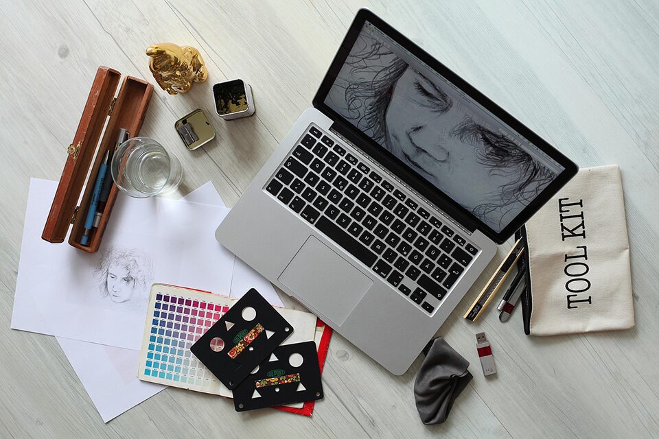
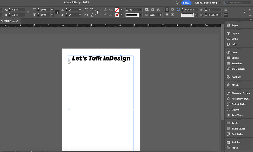
Graphic design—especially industry standard software programs like Adobe Illustrator and InDesign—can be daunting when approaching book design, particularly without a previous background in art or graphic design. There are so many different facets to keep track of and consider like complimentary colors, tone, contrast, font choice, hierarchy, graphic size, and so on. Below are some of the things that helped me when I was dipping my toes into graphic design without any previous experience.
Design feedback can be tricky for the inexperienced. Even if you’ve been giving design feedback for years, it can be hard to express the feelings you have about a piece without discouraging your colleagues—or to put into words intuitive or feeling-based critique.
From covers to interiors to collateral, InDesign is great for book designers, especially because it is a publishing industry standard. However, learning InDesign can be quite a task, especially if you are new to the industry. Here are some helpful InDesign tips that I have learned during my time at Ooligan Press.
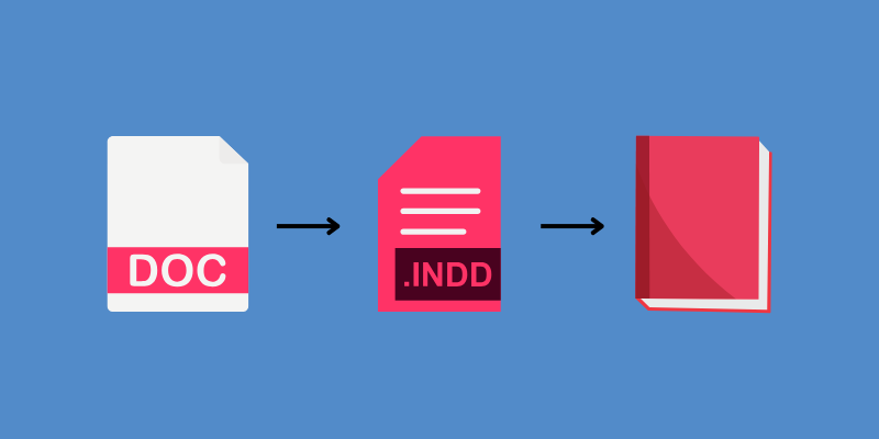
Books at Ooligan take a wonderful journey as an author writes, editors edit, and publishers publish. Throughout it all, there is a design lead (that’s me!) who is making sure that the Word document turns into a tangible book that you get to hold. This is the process of turning that digital file into a ready-for-print file here at Ooligan.
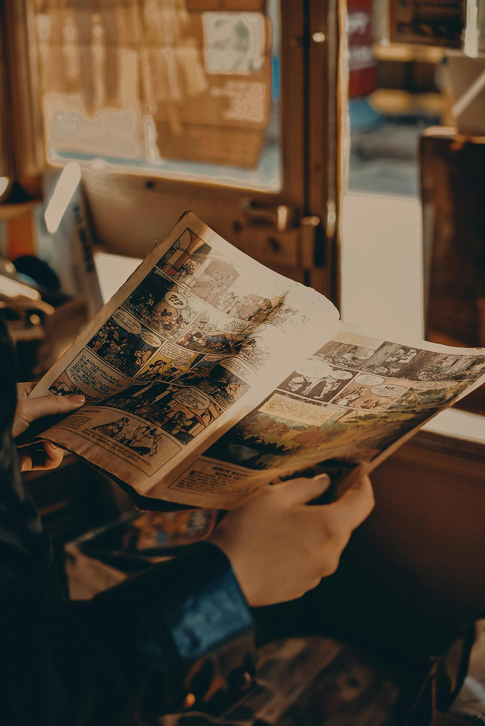
In order for us to perform our proofreading, Isaac had to teach us these industry standards which opened up many students’ eyes to the complexity of comics. Who knew the letter I could cause so many problems?
It’s important to be well-rounded in the industry, so—through trial and error—I have gained knowledge that has helped me become a designer when I have never been one before! Through my few short months of being at Ooligan Press, I have learned some tips and tricks that have helped me become a better designer.
It’s not a bad cover by any means, but in a world where the books we read often perform as style accessories on top of mere storytelling vessels, I knew there was an opportunity to give her something more unique—something she’d love to pick up based on the cover alone. Not to mention that personalized gifts are always the best anyway!