The Journey to Our First Graphic Novel
In order for us to perform our proofreading, Isaac had to teach us these industry standards which opened up many students’ eyes to the complexity of comics. Who knew the letter I could cause so many problems?

In order for us to perform our proofreading, Isaac had to teach us these industry standards which opened up many students’ eyes to the complexity of comics. Who knew the letter I could cause so many problems?

It’s important to be well-rounded in the industry, so—through trial and error—I have gained knowledge that has helped me become a designer when I have never been one before! Through my few short months of being at Ooligan Press, I have learned some tips and tricks that have helped me become a better designer.

It’s not a bad cover by any means, but in a world where the books we read often perform as style accessories on top of mere storytelling vessels, I knew there was an opportunity to give her something more unique—something she’d love to pick up based on the cover alone. Not to mention that personalized gifts are always the best anyway!

Think of book design like giving a gift. The wrapping paper or gift bag you use to conceal the contents will affect how excited the person receiving the gift will be to discover what is inside. These visual influences are psychologically conditioned in our brains from early childhood that either draw us towards what we typically like or alert us to avoid the undesirable.
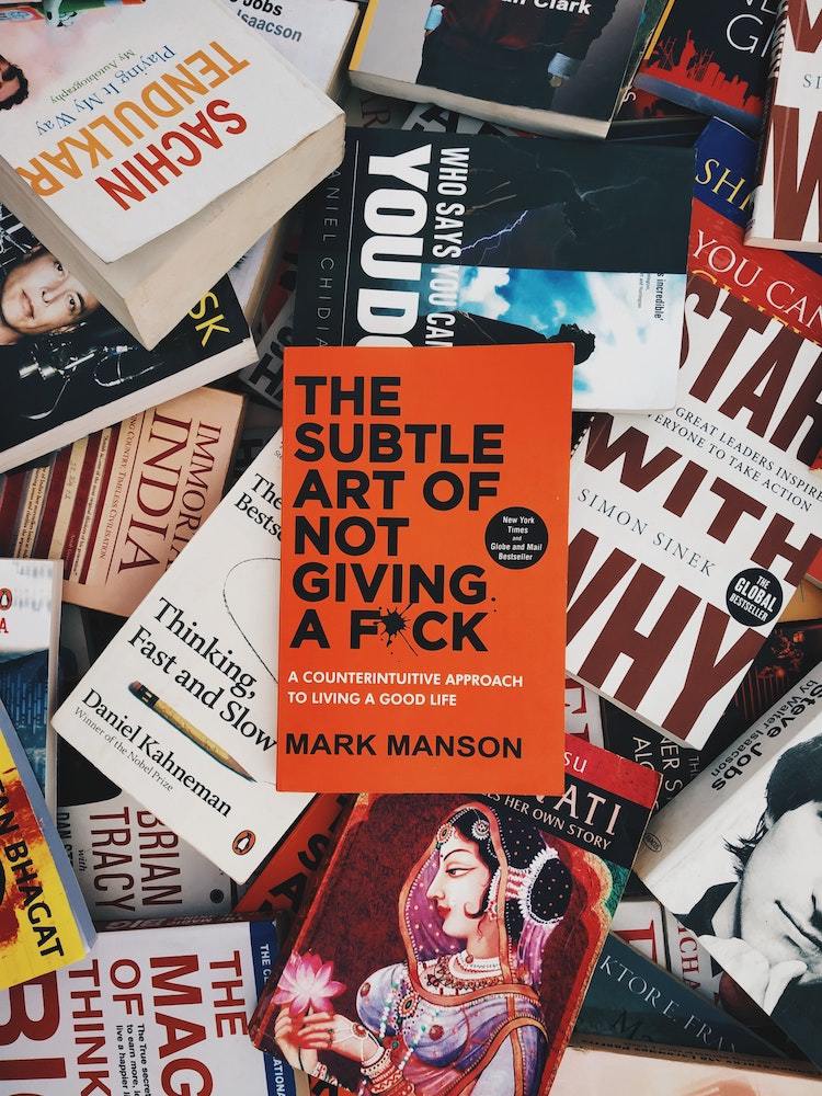
Have you recently gone to a bookstore and noticed the majority of the books displayed in the front all resemble similar book cover designs? These clone-like copies are actually very purposeful and mark a new age of book cover designs.
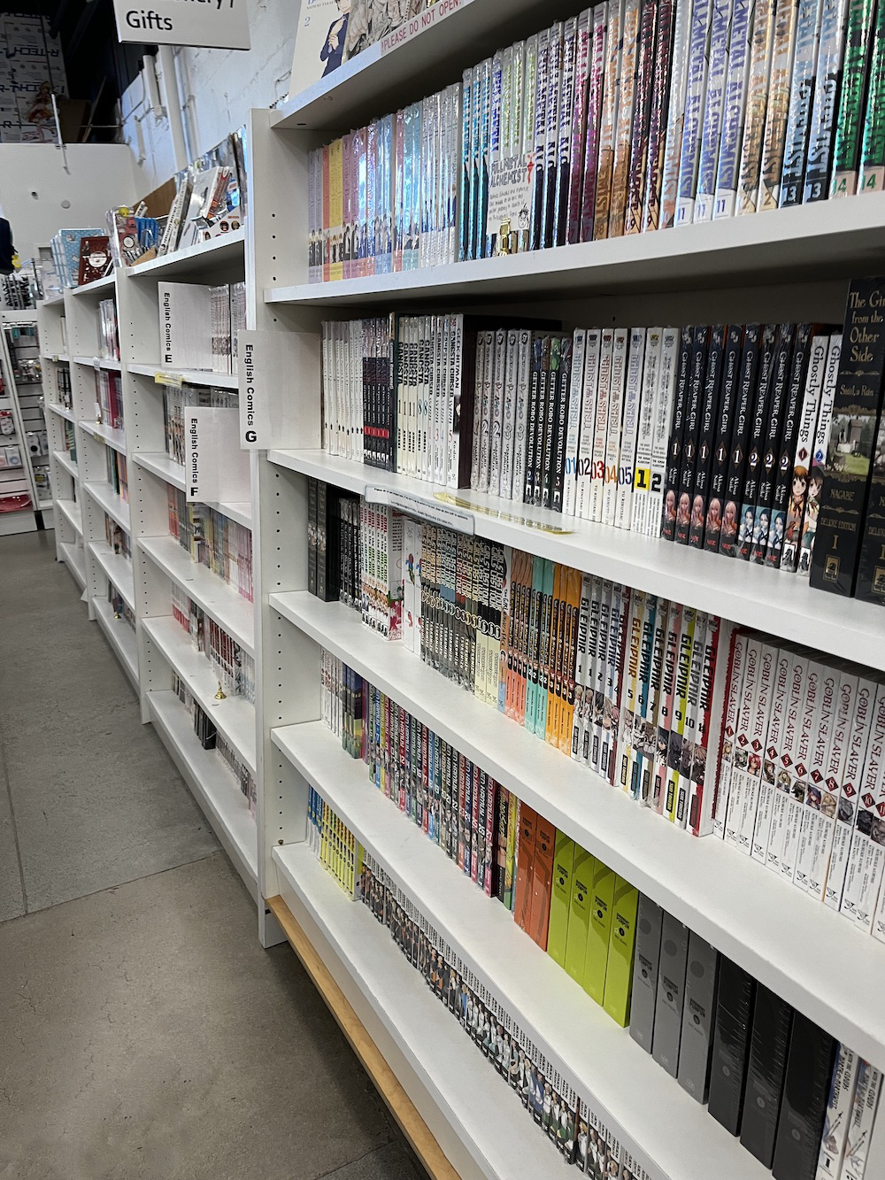
In many US bookstores manga is not sorted by subgenre. Given this context, it’s extremely important for information about a volume’s genre and intended audience to be conveyed through the cover.
At Ooligan, everyone is a designer, editor, proofreader, marketer, and publicity specialist. So our efforts, while always noble, are not always cohesive and streamlined.
A galley is an unfinalized advanced reader copy of a book that, unlike the final product, typically uses the manuscript prior to the final proofread. Before the galley is produced, the manuscript goes through developmental edits and copyedits to the point of practically perfect. Occasionally, the galley is made using the final draft but never by using any draft before the second to last. Galleys can be in hard copy or electronic form, which may make you wonder: Why even make a galley?
When designing a book cover, your goal is to attract the attention of your target market without misleading them, and that begins with selecting an appropriate font.
The good news is that like many other professional-level tools like InDesign, we only use a small number of its features on a day-to-day basis. The bad news is that over the lifetime of a book, that exact “small number” changes, and by the time the manuscript is all placed, the layout designer will have checked or changed nearly everything the computer needs to know about how to format the book. The best way to become fluent with a tool like InDesign is to practice, practice, practice.