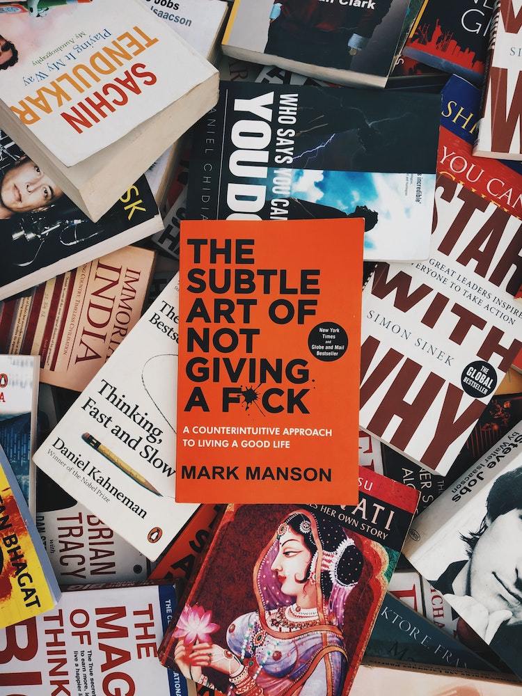
Choosing a font for a book cover is a critical decision. Strong cover typography can help draw target readers towards your book; weak cover typography will quickly suggest to potential readers that the book is unprofessionally produced, and that might very well turn them away. There’s certainly a lot more to typography than mere font choice, but font choice is an important start, especially when you’re starting out as a cover designer. With a seemingly infinite number of font choices at your disposal, how do you sort out the “good” ones? Here are some helpful tips for choosing effective cover fonts.
1. Not all fonts are title fonts.
And preemptively, not all fonts are professional-grade. If Tip number one is sticking to title-bound fonts, Tip number zero is to stick to credible foundries, and sticking to Adobe Typekit fonts is a great way to do that. Moreover, avoiding “free” font websites will keep you out of potential trouble with licensing issues.
Even in the pool of professional fonts, not all of them are built for cover typography. There are plenty of wonderful body text fonts out there, but they’re built such that they have advantages for body text typesetting that don’t translate well to use on covers. Steer clear of using these fonts as your cover title font. This would be like trying to fit a square peg into a round hole, and we can’t have that. You wouldn’t use a display font for your body text, and the logic of that goes both ways.
Adobe Fonts can be helpful in suggesting whether a font is destined for cover typography or not. Even simply witnessing how Adobe presents the font and shows it off can offer clues as to whether or not the font is meant for display purposes. And as always, you can look to professional book covers to get ideas for examples of professional cover fonts. When it comes to book design, imitation is more than a high form of flattery; it’s a reliable learning method.
2. Tailor font choice to the book’s intentions.
On top of being credible, cover fonts should be appropriate. Of course you wouldn’t use a script font for body text. You also wouldn’t use a script font on the cover of a sturdy John Grisham-esque suspense thriller. It’s critical to choose fonts that match your book’s intentions, fonts that agree with the book’s content, and fonts that speak to the book’s target audience in tones that are both assuring and exciting. When designing a book cover, your goal is to attract the attention of your target market without misleading them, and that begins with selecting an appropriate font.
Again, looking to comp titles might be your best strategy here. Study the conventions of different genres to learn patterns about their cover designs. For example, romance novels often have decorative script fonts with fancy flourishes on the letterforms. Contrarily, contemporary mystery novels typically showcase crisp sans serif fonts with breathy, spaced-out typography. When choosing a font for a book’s cover, if you ignore context, you’ll miss the mark every time.
3. Typography’s work isn’t finished after the font selection.
As self-publishing pro Tucker Max expertly advises on his blog Scribe Media, “The fonts on professionally designed covers are never just typed onto the cover … Even the perfect cover font will look unprofessional unless it is worked into the overall design.” This is where using professional-grade software really elevates your work. InDesign allows you to expertly manipulate typographical elements such as spacing, shading, relative sizing, lines, and more. Once you’ve chosen the right font for your cover, spending some time and energy tailoring the typography to your specific uses will mean the difference between an amateur-looking cover and a professional one. Invest time into simply playing with the typographical capabilities of InDesign; maybe try to recreate some of your favorite covers. The more well versed you are in typographical manipulation, and the more comfortable you are with your tools, the more successful you’ll be.
It’s an important job, cover design. And picking the right cover font might just be the most important decision you’ll make in that design process. But following these three tips can help guide you along toward producing successful cover typography.


Milton Ben
This blog is so informative, I really impressed by this article. As a typographic designer, it is so helpful for me.
Milton Ben
This blog is so informative, I really impressed by this article. As a typographic designer, it is so helpful for me.