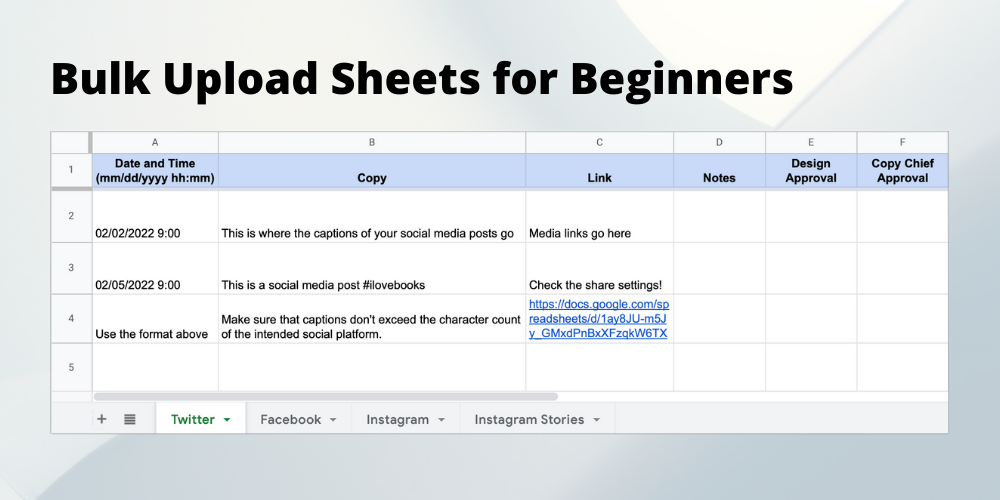
LAUREL EVERYWHERE Press Kit Prep
The LAUREL EVERYWHERE team members had their work cut out for them to compile and utilize Ooligan’s first-ever press kit.
With millions upon millions of people in the United States who think they have the next New York Times best seller, how can a publishing company find the diamond in the rough? What can a publishing house do to ensure they are receiving submissions for books they actually can and want to publish? The most effective way a publishing house can convey this information to an author is through the company’s mission statement.
Writing book proposals can seem intimidating. Writing the book was hard enough, and now you have to get other people to like it too. The number of resources for writing query letters is infinite, with published authors, agents, and publishers all weighing in on what makes a good query letter. But what about the next step—the proposal package?
With The Gifts We Keep by Katie Grindeland launched into the world and doing well, my team at Ooligan Press is racing forward with the next book to be published as part of our partnership with Multnomah County Library: Iditarod Nights by Cindy Hiday! This is the second of the Library Writers Project selections to be annually published through the unique partnership between Multnomah County Library and Ooligan Press, and we are excited to be taking this new manuscript through the publication process.
Big companies have the money to outsource photographers, and that’s great. It provides freelance photographers work and gives them a great source of income. Many smaller businesses, and especially publishers, do not have those kinds of resources. So we have to make do. But how?
Sit in a room full of English majors long enough, and you’ll eventually hear someone groan, “Ugh… math.” The topic may be differential calculus or how to split the tab, but the sentiment is always the same. Why, the lover of words bemoans, do we have to take a break from talking about books to do things with numbers?
In the past, the Ooligan blog has posted some great advice about query letters. For those who have never written a query before, you should go check those out first. However, with those resources available, we wanted to dive deeper into some pitch concepts: framing and in-person pitches. While the latter will primarily be of use to those participating in Write to Publish (or similar writing conferences), framing your book correctly is useful in all cases. Doing it correctly can really give your query letter a leg up on the competition.
Proofreading season is upon us at Ooligan Press. Really, that’s a bit of a misnomer—it’s not every year that all of the proofreading tasks align the way they have this winter. But align they have; we are rereleasing the ebook editions of Tony Wolk’s Abe Lincoln Trilogy just in time for Presidents’ Day, which means we have all three books that need to be proofread. We are also proofreading the ebook version of 50 Hikes (which publishes March 1!) and have just wrapped up on a proofread of Three Sides Water.
From intimate readings to established conferences and book festivals, we’ve spent a lot of time over the past few months arranging opportunities for the world—at least our Pacific Northwest corner of it—to meet our books and their authors. There have been plenty of volunteer schedules to fill, promotional marketing and social media posts to plan, and boxes of books to cart to and fro. In return for that work, we’ve watched our authors delight and charm audiences while their books are admired, applauded, and carried away to new homes. So where in the world have we found Ooligan authors this fall?
Typography is an important aspect of any cover. It’s the first thing readers read on a book. The typeface must not only be compatible with whatever images are displayed on the cover, but also with the genre in which the book is positioned. Covers that use the typography as their primary design feature are referred to as “typographic covers.” These are the ones with limited imagery, photographic or otherwise, where the title and author take up most of the space. With these covers, finding the right font is more important than ever.