
Questions asked in the process of writing a cover brief for Sleeping in My Jeans: How should the cover of a young adult/suspense novel look? What should be on the cover to represent homelessness, hope, and the bond of sisters? Is the design going to be realistic or abstract?
Requirements of a Cover Brief. The first four items listed on the cover brief are Title, Author, Trim Size, and Genre. These items have already been determined and are easy to fill out. The next item is the Synopsis and tells the designers what the manuscript is about. This is mainly for those who haven’t read the most current draft of the manuscript. It won’t help designers if they read the second edit of a manuscript and the cover design is for the fifth edit. For Sleeping in My Jeans, the synopsis was hard to write because the manuscript was still going through a developmental edit. The main plot has been decided, of course, but key elements like the antagonist weren’t finalized yet. The synopsis of a cover works like the back cover copy of a manuscript, but as an internal document, spoilers are allowed to help guide the designers.
The next three items on the cover brief are what I consider to hold the most concrete details of the manuscript: the Main Themes, Key Visual Elements, and Minor Visual Elements.
Sleeping in My Jeans is about Mattie, a sixteen-year-old girl who becomes homeless along with her younger sister and mother, but there’s more to the story than this surface-level summary. Main themes come from the details of a manuscript. For example, in Sleeping in My Jeans, “racial identity” is a key detail because Mattie appears differently than her mother and sister; the feelings she has about her biracial identity contrasted against a majority of white students at her school contribute to that theme. When deciding the main themes, I also added details to explain why those themes were listed because themes can be so vague and general. Another theme listed for Sleeping in My Jeans is “danger;” how a designer illustrates “danger” changes depending on where that danger comes from. Is the danger a serial killer, poison, or human lies? To find out where the danger comes from in Sleeping in My Jeans, you’ll have to read the book when it comes out next Fall.
The Key and Minor Visual Elements of the cover brief should be concrete details that a designer could use when making a cover. Some items listed for Sleeping in My Jeans are peanut butter sandwiches and the Eugene library. Mattie and Meg ate peanut butter sandwiches because that’s all they had, and they went to the library because they were homeless. As I was listing these visual elements, I added details from the manuscript so designers could illustrate the items in the context of Sleeping in My Jeans. One of the visual elements listed was “burgers,” but I didn’t want designers to create a commercial style burger, I wanted a “burger thrown away, that Mattie fights over with a homeless man,” which would be a visual difference. Details mattered a lot in the process of creating the cover brief for Sleeping in My Jeans.
The Potential Color Palette for Sleeping in My Jeans borrowed parts of Ooligan’s last YA novel. Just like the visual elements, the colors should represent the themes, but they are more vague so the description for our brief was left open to interpretation.
The last items on the cover brief template are Additional Thoughts and the Types of Covers to Consider. In the former section, anything that is relevant to the manuscript and how it should appear is added. Homelessness and domestic abuse might lead designers to create a dark and serious looking cover, but as stated in the cover brief, “the narrative isn’t exactly that dark and full of violence;” this novel is for young teenagers.
Types of Covers to Consider basically gives an example of how an ideal cover would appear and summarizes the Things we like and Things to avoid section of the cover brief, which is mostly copy/pasting good and bad cover examples. The Sleeping in My Jeans brief separates the book covers that we liked into those that were: Abstract/Illustrated, Close ups of significant objects, and Focused on typography. Things to avoid in the Sleeping in My Jeans brief were: Photographic images of characters, Clichéd representations of homelessness, or covers Too Dark/Gray and angled toward a thriller genre.
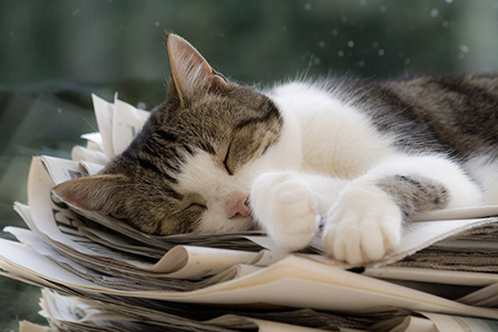
Finally, why is there a sleeping kitten as the image of my blog post? Because when Sleeping in My Jeans is Google Image searched, there are a surprising number of kittens and cats napping. The results of the search term is limited by “Usage Rights/Labeled for Reuse” of course, but they still dominate the screen. I included the image as a reminder for designers when creating a cover brief that unexpected results might pop up.
Cover briefs should be detailed and help the designer understand the message of a manuscript otherwise they are left on their own. Even if the designers have read the manuscript, a guideline of what the project manager or design lead wants is important; different interpretations of the text, the marketing angle, and other covers in the market affect the brief’s guidelines.
When creating a cover brief, the designers need to know which themes, visual elements, and details are more important to highlight, representing not just their aesthetic style but the narrative of the manuscript at its best to attract readers.