
When it comes to publishing, you should judge a book by its color. Despite the popular phrase discouraging the practice of judging a book by its cover, a good book cover has been carefully crafted using color to tell you everything you need to know about the content inside in just a quick glance. Although many elements make up a strategic cover, such as font, texture, layout, photographic or drawn elements, and the text to image ratio, one of the most important ways designers do this is with color.
Color theory is a popular topic in discussions about interior design, website design, fashion, and elsewhere, but it also plays a vital role in the publishing industry. The color of a book cover affects your judgment of a book before you even read the description. If you were browsing a book shop, what would drive you to pick a random book off of a shelf if all you could see was the spine? It is likely that something about the color would catch your eye first, causing you to grab the book off the shelf. If you were shopping for books online and saw a related title that looked interesting, you would probably click the link because the color had drawn your eye to other design elements that caught your interest.
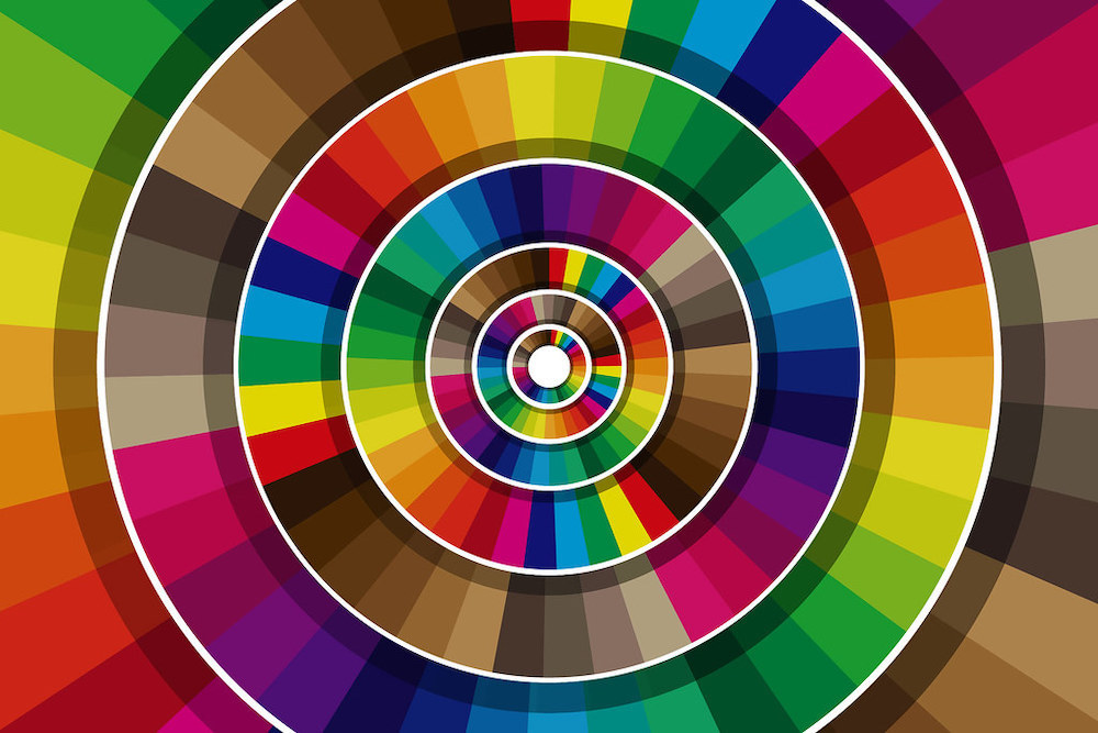
So, if color is so important, how do we use it to tell audiences what they need to know about a book? It is important to consider two things: first, how colors affect our emotions, and second, the way typical colors are used for different genres. It’s also important to consider how subverting these rules can create a striking result.
We’ve all probably heard that cool colors are more calming, and hot colors are more exciting. Maybe you’ve heard that colors like red, orange, and yellow are more likely to make you hungry, resulting in fast food signs with fiery shades. In book cover design, color functions similarly. Blue is a calming color that promotes trust and mental engagement, which is why it can be seen on covers for thought-provoking fiction, political memoirs, and nonfiction. Red can be used to communicate strong, bold feelings like passion, angst, or energy. This is why you might see it on a horror cover, but different hues will also show up on the covers of romance novels. Most white covers indicate minimalistic and straightforward books, as white is a symbol of purity and simplicity. Black covers will often be observed for horror, thriller, and mystery genres, where it suggests mystery, death, and suspense, while shades of green can be used for fantasy novels and environmental nonfiction. Yellow is often used for feel-good and self-help titles. For a detailed study on emotional reactions colors can illicit, including a chart of various shades and their results, visit Cover Design Studio’s post on the Best Colors for Book Covers.
These rules can help guide designers in their selection of a main color for a cover, but the secondary colors are just as important. The selection of secondary colors (covers will usually feature more than two colors) can be done by looking at complementary colors, which are opposites on the color wheel, or analogous colors, which are neighbors on the color wheel. Keeping in mind the genre of the book and what you want to say emotionally with the color choice, contrast is key. Juxtaposing bright and dark shades will increase visibility regardless of the genre. Dark backgrounds convey seriousness and authority, and softer pastels convey nuance and lighter subject matter. But even at different saturations, contrast can be used in color by selecting complementary or analogous colors.
The typical colors for a genre will only take a designer so far. Breaking the genre rules, like including yellow on the cover for a thriller or horror novel, is a great way to catch the eye of a reader in a sea of black and red covers. These rules and tactics are only made to be used and broken in a way that achieves the desired result, so designers shouldn’t be afraid to make a bold choice. The payoff could be enormous.