One of our ongoing projects at Ooligan Press is debut author Meagan Macvie’s YA novel The Ocean in My Ears. It’s not releasing until the end of 2017, but we’ve already finalized our cover design and are fine-tuning our promotional efforts. Even after the rise of social media marketing and the trend toward digital publication, the cover arguably remains the most important piece of marketing material in the publisher’s repertoire. Intuitively, we as publishers put a lot of time and energy into creating covers that not only catch the eye but also provide insight into what kind of story is being told, so as to persuade a possible target consumer.
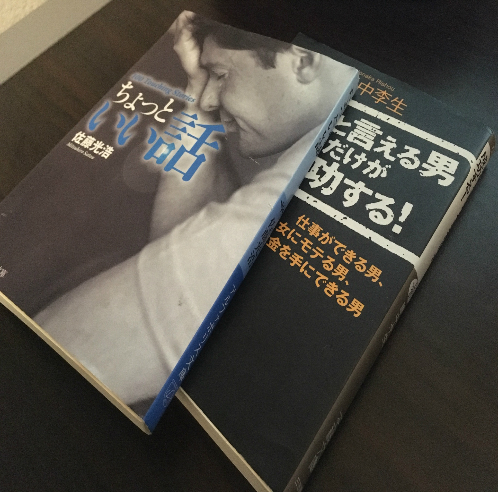
One would think these principles of cover design are universal, and yet, I’m staring at a couple of Japanese novels on my desk and can’t help but wonder if the standards of design are a little bit different (read: awesome) there. Japanese best sellers, especially foreign titles, are often printed as “bunko,” which are similar in form and function to mass market paperbacks in the West. However, they do tend to be a bit shorter and slimmer than western paperbacks, and they are usually only about two hundred pages long. Because of this length restriction, many western best sellers are often split up into multiple volumes. These criteria mean that cover designers have less space to work on per book, but potentially more books are available. You might notice an almost universal trend of larger, more numerous typographic elements on Japanese covers. As my team has been working on a YA cover, I’m specifically interested in that market. As a teaching example of differences in YA cover design between Japan and America, one need look no further than America’s favorite dystopian series about ritual teen murder and bird-themed rebellion: The Hunger Games.
American Cover:
Japanese Cover: 
The American cover of The Hunger Games is dark yet expressive, prominently featuring a gold pin of the mockingjay, a fictional bird used in the story to symbolize the spirit of revolution. The Japanese cover designers said to hell with all that and depicted Katniss (and most likely Peeta) in standard manga/anime style. This is the perfect example because it highlights a couple key differences between American and Japanese cover design strategies.
First, the cover is character centric, as the design of characters is seen as the most important element of plotting in most Japanese media. For example, a Japanese anime, movie, or video game will most likely advertise the character designer before the director, creative director, writer, etc. Many YA novels in the West will put a cast of characters on the cover, but there is always pressure here to highlight the setting or symbolize the plot with abstract design work. Such elements rarely make it onto Japanese covers.
Second, the anime renditions of Katniss and Peeta are a clear designation of the age group this novel is intended for: young adults. Children and teens in Japan are the primary consumers of manga and anime, and they have hundreds of options to choose from every season. In order to catch the consumer eye, many Japanese cover designers emulate manga-style art. This is the most popular way to advertise YA fiction in Japan, with some of the more famous examples being The Fault in Our Stars, the 39 Clues series, and Twilight. This manga-style rule often expands into adult fiction as well. For example, these amazing covers for George R. R. Martin’s series, A Song of Ice and Fire, which have many split editions because the books are so lengthy.
These observations are by no means rules, and there are certainly western YA novels that make it to Japan with the cover design work largely unchanged, but it is interesting to see how differing cultural norms and demographics can alter how a novel is presented on the store shelf.

