
Romance novels have recently started gaining popularity. In light of the world’s current emotional climate, readers are looking for more feel-good stories to help lighten their spirits and escape reality. With the ever-growing popularity of the genre, there has been a surge in the number of contemporary romance book releases. I thought it would be interesting to explore the current cover trends and see how these trends have shaped designers’ choices.
It is important that designers capture the light-hearted, feel-good nature of a contemporary romance story through its cover design in order to gain the attention of readers. Here I will break down the design elements that I feel are the most prominent in some recent releases in this genre.
Color Choices
There has been a recent trend in color blocking and using bright colors in cover designs, specifically the use of colors such as yellow, pink, and light blue. These covers have minimal backgrounds and use these bright, eye-catching colors as the main backdrop, making the rest of the colors in the cover’s design stand out. The use of such bright colors alludes to the fun and happy nature of these romances. Having these simple colors as the background also creates a great spotlight for the rest of the elements in the cover. Designers seem to be keeping the overall color choices to about three or four colors per cover, and then incorporate those specific colors into different elements of the design. Simplicity is key!
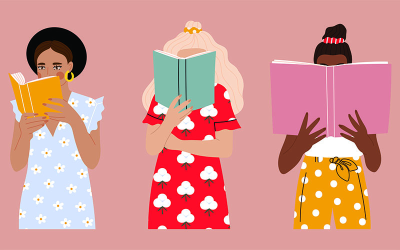
Illustrations
Having people on book covers can be a big no for some readers. It is typical for romance novels to have real people displayed on their covers, and this frequently draws people away from these types of books. Readers do not want other people to see the cheesy “cliche” books they are reading. However, contemporary romance novels have recently incorporated illustrated characters, silhouettes, and other imagery into their designs. Most of the characters on these covers are faceless, but there are some instances where they have minimalistic features. I believe these are excellent choices and do a great job drawing in readers with these simple yet beautiful illustrations.
Font Choices
A majority of the recent covers in this genre have used sans serif fonts, with the occasional serif font sprinkled in. There is a lot less formality in a sans serif font, and it alludes to modernity. Sans serif fonts help contribute to the clean, minimalistic designs that have recently been seen in this genre. I think this is an excellent choice for these dynamic designs. These new and “trendy” designs are very eye-catching. The beautiful designs attract readers and intrigue them to learn more about these fun stories. I cannot wait to see what other beautiful covers will come out of this genre in the next couple of years.
How do you feel about these stylistic choices? Do you like these vibrantly illustrated covers as much as we do?