
One of the basic goals of a book designer is to make a manuscript as easy to read as possible. This requires examining and altering the flow of the words, the spaces between lines, and the spaces between letters. Some may argue that a designer’s most important job is to choose a font that enables consumers to easily read the book.
Here at Ooligan, part of our mission is to recognize and represent marginalized communities of the Pacific Northwest in the books we publish. One such marginalized community includes individuals with learning impairments, such as dyslexia.
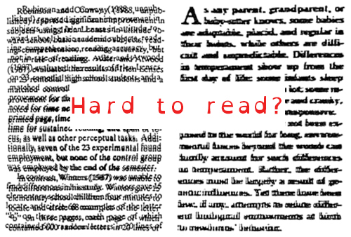
For those readers who may not be familiar with dyslexia, the International Dyslexia Association states that “it is characterized by difficulties with accurate and/or fluent word recognition and by poor spelling and decoding abilities.” For many, this can lead to a struggle to comprehend the words on a page. An example can be seen on Wired‘s article, “What the Internet Looks Like for Someone with Dyslexia.”
So as designers, how can we ease the reading process for people who have dyslexia and similar learning impairments? Something to consider is looking into accessible fonts.
In recent years, multiple graphic designers—a few having dyslexia themselves—have created various new fonts designed to be easily read by individualizing each letter to create a smoother reading experience. This is done by creating larger openings in letters like c and e, as well as varying the thickness to make each letter distinct.
Three such fonts are Dyslexie, Open Dyslexic, and Read Regular. Dyslexie was designed by Christian Boer originally as a final thesis project in 2008, and it was created by designing each letter as a 3-D object before converting it to 2-D. Boer himself has dyslexia and made the font free for personal use in 2014. Open Dyslexic is an open-source font that uses heavy weights on the letter bottoms to indicate direction and create more distinguishable shapes for each letter. The Read Regular typeface removed extraneous serifs and reshaped each letter to emphasize their individuality and create a distinct outline.
We are lucky enough to live in a time where designers have created typefaces that can help ease the reading process. That is, after all, a book designer’s primary job. As a member of a press that focuses on inclusion and representation, it is always worth learning more ways we can make our books accessible. As a new designer, learning about dyslexia-friendly fonts offers a new world of future possibilities in ease of reading—for all of our readers.