Ask any avid reader, and they will be able to recall a moment when they simply had to choose a book because of its compelling cover design. I remember, at age eleven, seeing a copy of Lois Duncan’s 1976 young adult horror novel Summer of Fear featuring its original cover art at the Multnomah County Library and knowing immediately that I had to read it. And it wasn’t because I enjoyed the cover design; it was because I could barely look at it. The image of a teen girl with a ghoulish face superimposed over her own had frightened me so profoundly that knowing more about the contents of that book was a compulsion. Good book covers do a lot of work to visually represent the tone, themes, style, and content of the material within. A good horror cover must do this work and inspire fear. When designing a cover for a horror novel, there are a few key stylistic and visual elements that raise hairs and help get books off of shelves.
Imagery is the first thing to consider in the design of a horror book cover. This is the most direct reflection of what the book itself is about. What is the most frightening element of the story? Is it a monster? A location? A moment of action? A visual representation of any of those aspects conveys an idea of the book’s narrative. The best images give the least away while still inspiring fear and interest in a casual book browser.
The image alone isn’t enough. The style of art and color palette give context to why that visual is a strong representation of the horror book as a whole and help establish the cover as eerie and genre-specific. Many horror covers have similar color palettes, which generally include grays, blacks, whites, and browns shot through with bright red. Besides the obvious morbidity of red representing blood, the pop of color also immediately draws the viewer’s eye. While covers in other genres may benefit from bright hues or soft pastels, rarely do those palettes convey the sense of foreboding of a good horror cover.
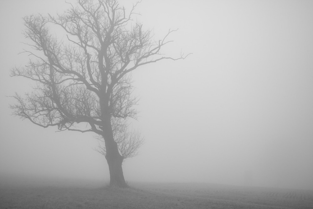
The style of the cover is the design element that perhaps has the most influence on conveying the tone of the horror book. An abstract cover, or one in which the image is blurred or distorted, suggests a warped sense of reality or perception. This technique is best executed when the image is of the story’s monster or of a terrified reaction, such as a screaming face. The ideas of madness and manipulation are implied to the reader before they even read the back cover. If the cover imagery is realistic, depictions of the story’s creepy setting, an unexpected object that serves as a motif, or a small glimpse of the monster’s form are suggestive while revealing very little, and thus piquing a casual browser’s interest.
As with any creative endeavor, whether a horror book cover is effective or not can be highly subjective. There are, however, key thematic similarities explored through best-of compilations such as Emily Temple’s entry for Literary Hub. Above all, a good horror cover conveys a sense of foreboding that can only be quelled by consuming the contents of the book.

