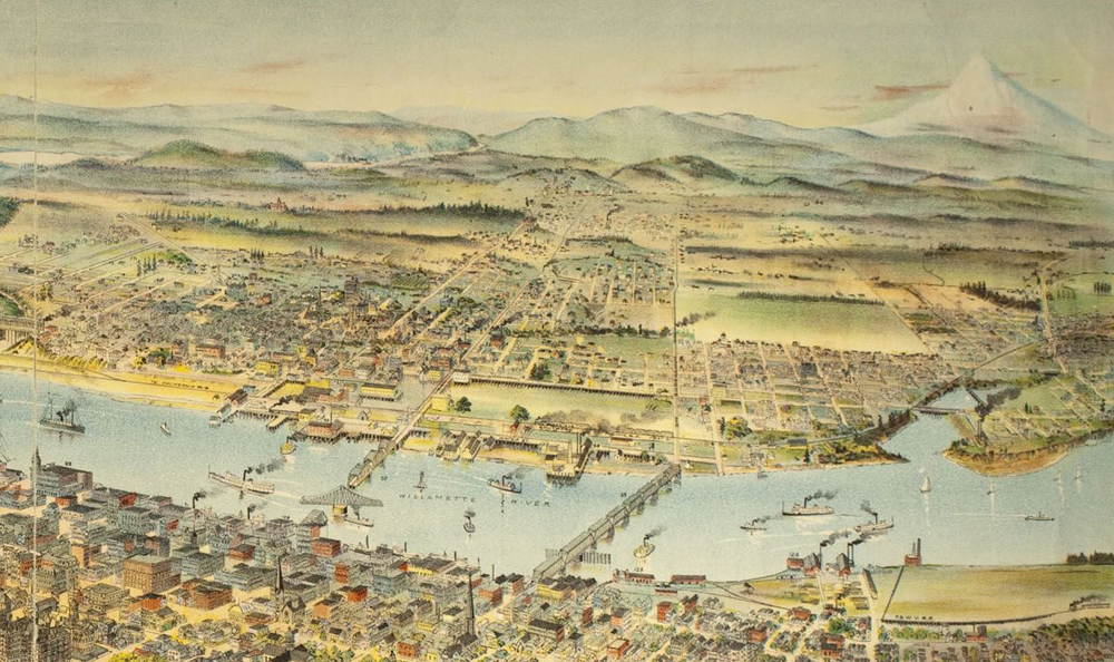
Suzy Vitello’s Faultland has evolved quite a bit as a novel since Ooligan acquired it, and the rest of the project is developing well, too. We’re planning our marketing strategy, finalizing the book’s description and gearing up for the last rounds of copyediting. All of this contributes to the feeling that the Faultland project is taking shape, but nothing makes a publishing project feel realized quite like finally getting a cover. We’re so close to having a final design as I write this. I can’t wait to share this striking image with the world.
Cover design is an important, frequently complicated affair for any press, but Ooligan’s process probably has most beat. We don’t select a single or small handful of designers at the outset. Instead, we invite the entire press to submit mockups. In several rounds of feedback from the head of the Design department and the rest of the press, all of the potential designers receive input on their ideas and make adjustments. Often, one designer will work on a few ideas simultaneously. For Faultland, we went through six rounds of feedback. Ooligan usually ends up with three finalists, but there were so many fantastic options that Faultland had four. I got Suzy’s feedback on those four, which was detailed and showed a great deal of understanding of the role of a book cover.
With her feedback in mind, the entire press weighed our options. This book’s cover was a tough choice. Any of the four final covers could have worked well, which was a surprise considering the book’s cross-genre content. (I had expected designers to fall too heavily on either the sci-fi or the literary side of the book, but many of them walked the line with style.) While voting, we had to remember that the cover isn’t primarily a work of art—it’s the book’s most important piece of marketing. We had to set aside our personal aesthetics and think about an audience that knows nothing of the novel’s content. For many readers, a cover can have a bigger influence on their choices than the book’s description or the author’s previous work.
I’m excited about the decision the press made. It’s an iconic image, and very “Portland” in all the best ways. Not to spoil the upcoming cover reveal, but as a big Blazers fan, I’m in love with the color scheme. We have a lot to work with as we apply the cover’s aesthetics to our other marketing materials.
As pleased as I am with our cover, there’s a bittersweetness to Ooligan’s cover selection process. Because of the collaborative nature of our rounds of feedback, we had the pleasure of watching several designs evolve and improve. In a world of extravagantly funded university presses, I’d publish editions of this book with each of the four final covers. After each cover vote I participated in, I felt like the press made the right decision, but still felt a pang of loss. So much work goes into covers that don’t end up being used. I want to find ways to make use of those alternate faces of Faultland. Sometimes, this press has more talent than we can make use of.

