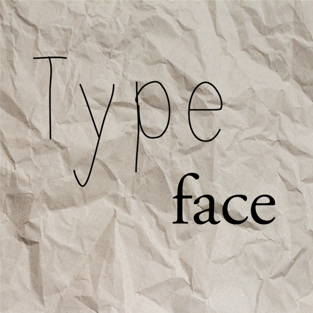
Fonts—they’re a big deal, especially when it comes to books. They’re the paint on the canvas, the thing that takes this image out of your head and presents it to the rest of the world. That’s no easy task, so picking the right font for your story is very important. It’s just as important as the cover design of the book, since the font is the one design element that your readers will constantly be exposed to throughout the entire time they are interacting with your story. However, it isn’t easy to find fonts that go together and that suit your book, and there are some challenges and rules to keep in mind. But as difficult as this process may be, it is also a lot of fun and a great opportunity to let your creativity shine.
Thankfully, there are hundreds of different fonts out there for you to choose from, so chances are you will find something that suits the story you want to tell. The first thing you need to do when picking fonts is to keep in mind the genre and tone of the book. In Typography 101, the first exercise you are ever given is to try and accurately represent a word using only one font. You are given a list of words and genres, and you have to try and match these three elements and get them to work together to visually represent the text given. It’s super fun, and this is a great place to start when picking out fonts for your project. You can start by taking the title of your book and trying to find fonts that match the words to the genre and that work together.
On average, you will be using two typefaces for the interior layout of your book. You may just use one if you like to keep things simple, and you might need more if your layout is more complicated, but you should always try to stick to no more than three fonts per project. You’ll need a primary font, which will be used for the bulk of your text, and a secondary font for your headers. Each one is unique in its own way, but they should be working together to create a cohesive design and to represent the content of your story in a visual manner.
The most important thing to keep in mind when searching for a font is legibility, whether this is for your header or for your body text. It doesn’t matter how pretty a font is—if no one can read it, it’s not doing its job. This is especially important for your body font. The best approach for body fonts is to keep them simple and easy to read, but that doesn’t mean they have to be boring; you can still customize a font to suit your book’s tone and needs.
While your header font should also strive for legibility, there is a little more flexibility to play around with some funkier designs and intricate lettering and get away with it, since the header is meant to stand out from the page and break up the text. You can confidently use script, decorative, or even handwritten fonts here, and that small touch will really make a difference to the reading experience.
Now, how do you find fonts that complement each other? Thankfully, there are a lot of ways to go about this. One way is to look at fonts made by the same designer. This is a good way to keep things coherent, since a designer will usually have a very distinct style and will often make fonts that complement each other. You can also try to look at fonts that were created around the same time. This is an especially good approach if you are designing a book set in a particular time period. Picking fonts that were designed in that same era will add an extra cool detail to your design. You could also try looking at sizing (picking fonts that are similar in height and weight), choosing fonts that are under one studio, choosing fonts that are popular in your genre, or just going with your gut! There’s really no wrong way to go about this. There are also endless resources (such as Explorations in Typography) that can help you match headers and subfonts for your project if you’re really struggling, in addition to websites (such as Identifont) dedicated to identifying fonts when you’re not sure what they’re called or who designed them.
The possibilities are endless, and at the end of the day, if you’re still not happy with what you found out there, you could always make your own or manipulate existing fonts to achieve the exact look you’re going for. Fonts are incredibly versatile, and there are thousands of options out there that can be made to work for you and your book.

