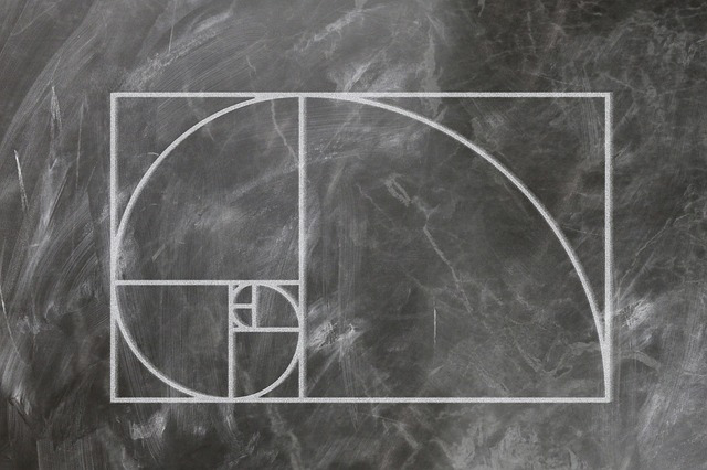
According to Syed Abbas, “the ‘golden ratio’ is a naturally occurring mathematical ratio derived from the Fibonacci sequence, where every number in the sequence (after the second) is the sum of the previous two numbers.” The line of thinking with the golden ratio is that, when used in design, it makes things proportional and easier to look at. It has many applications and there is a lot of mystery and myth surrounding its use. There are myths that this sequence of numbers has been used in the design of great architectural works of art including the Great Pyramids and the Parthenon. Other sources say that these claims are false and cannot be substantiated. This is especially true in book design. When we study book design and read the literature about it, it comes up quite often. Is this ratio actually an applicable concept in book design, or is its real-world use in book design another myth?
According to Andrew Haslam, German typographer Jan Tschichold researched many western books and manuscripts and discovered that many of them were printed in a “golden section format.” In other words, “the golden section rectangle (the page of a book) can be divided so that the relationship between the smaller and the larger is the same as that between the larger and the whole.” Haslam explains that “the consistent relationship between the square and golden-section rectangle creates a logarithmic spiral sequence. Each square relates to the next as part of the Fibonacci series.” You can apply this principle in book design. It is mostly applicable to the layout and spacing of the book. By using the golden sections as a guideline for your layout process, it could make decisions about proportions, placement, and white space on your page quicker and easier.
“The biggest issue with using the golden ratio in your designs is that the actual ratio itself, 1.618033, is an irregular number, meaning it is very hard to use the exact numbers,” explains Angela Roche. The best you can do is get very close to those proportions, meaning your proportions will be just slightly off. According to Roche, an easier way for you to apply this concept of proportion is the rule of thirds. The rule of thirds is simple—two horizontal lines and two vertical lines creates a grid of nine subsections. In theory, all main points of interest or attention in a visual image should align along those lines or at their intersections. Instead of trying to use the exact math of the golden ratio, you could use the rule of thirds to be more mindful of your proportions when designing a book.
When we look at the research and use of the golden ratio in book design, it is clear to see that the golden ratio can in fact aid you in your layout of a book’s contents including images, text, and white space. Many book designers have tried-and-true methods to their designs that they use every time they layout a book. At the end of the day, what really matters is the manuscript itself. If you can use the golden ratio as a guideline or template for your layout, do it. However, the golden ratio is not something that most book designers use or even think about all the time. It is more helpful to use the golden ratio as inspiration or a reminder to pay more attention to the proportions of your page rather than something you need to use everytime you design a book.

