
In 2013, a fourteen-year-old student, Suvir Mirchandani, was wondering how his school could reduce its ink consumption after receiving tons of daily handouts. He started his research by focusing on the most frequently used letters in these handouts: e, t, a, o, and r. Then he applied them to four different types of fonts—Garamond, Times New Roman, Century Gothic, and Comic Sans—and compared their ink consumption.
As a result, Mirchandani found that Garamond is the most efficient font. He calculated that the school district could minimize its annual budget by $21,000 if it changed its main font to Garamond. He submitted this research to the Journal for Emerging Investigators (JEI) in 2014. Out of two hundred entries, the JEI committee was interested in Mirchandani’s discovery and encouraged him to conduct further research for the US federal government. By investigating the Government Printing Office’s (GPO) documents, Mirchandani concluded that the United States can save $234 million just by switching the font on its documents.
These simple but eye-opening findings were immediately disseminated by mass media and reached the GPO. Even though the GPO acknowledged the findings, they withheld whether or not they adopted Mirchandani’s suggestion.
It seemed likely that Mirchandani was aiding in US environmental conservation; however, experts have pointed out flaws in his analysis. The Portland-based fonts and typography expert Thomas Phinney argues that under the same point size, Garamond is smaller and thinner than other fonts. While Garamond eventually requires less ink than other typefaces, it is also harder to read.
Artists Matt Robinson and Tom Wrigglesworth prove that under the same scale, the thinner and smaller the fonts are, the less ballpoint pen ink they consume. By comparing the eight most commonly used fonts, Robinson and Wrigglesworth’s handwriting experiment shows that Garamond uses the least ink.
A lot of people who read newspapers are elderly, so legibility in printed media is crucial. Illegible writing will even keep younger people from reading. We should not put learning aside in order to lower costs and reduce environmental strains. So what can we do to balance readability, cost efficiency, and environmental conservation?
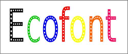
If we cannot minimize the size or dilute the font, what about reducing the area of ink in a letter? SPRANQ, a Dutch design company, has developed a software called Ecofont. Described as “Swiss cheese” or “worm-eaten,” Ecofont has holes in its letters, which reduces the amount of ink consumption. SPRANQ explains that by using its Ecofont software, we can reduce 28 percent of ink and toner consumption for the Arial font. Furthermore, it can be reduced up to 50 percent if we pick the extra saving options. The available fonts with Ecofont are Arial, Calibri, Times New Roman, Verdana, and Trebuchet MS. Ecofont software punches holes in these frequently used typefaces.
While many people may not mind Ecofont’s tiny holes, there is a technology that gets rid of them. The British media company Archant has introduced FM screen technology, as well as an Ecofont-like typeface. Archant enables its newspapers—the Eastern Daily Press, the East Anglian Daily Times, and the Hunts Post—to be as readable as ever by minimizing ink consumption without affecting legibility. Thus, the combination of FM screening and Ecofont is the best way to balance readability, cost efficiency, and environmental conservation. The problem is whether or not FM screening is available to everyone.
Even though Mirchandani’s idea was defeated in terms of practicality, he has suggested the most important aspect of saving the environment: changing our behavior. We can start by changing what is near to us. For example, most schools specify using Times New Roman for assignments. It would be a big deal if they changed the requirements to fonts that consume less ink, such as Garamond or Courier, or maybe even Ecofont. I would like to suggest that school teachers and college professors try out these fonts. We still face a dilemma between habits and innovation, but we can take it slow. We can go back to Times New Roman at any time if we feel that these fonts hinder our studies. The important thing is to take the first step.