
Many people now use books as collateral (or swag) to introduce themselves and their services, to showcase their portfolios, or to promote their expertise. These “books” might be produced by a team or service who takes the basic content and makes it look professional, taking care of everything from image quality to order tracking and personalized photographs.
But what if you’re not looking to create something quite that high end? What if you have a tight deadline and you want to make something that’s quicker and less expensive, such as a cookbook for your PTA fundraiser or an anniversary memento for your grandparents? Or even a booklet to use as a wedding favor?
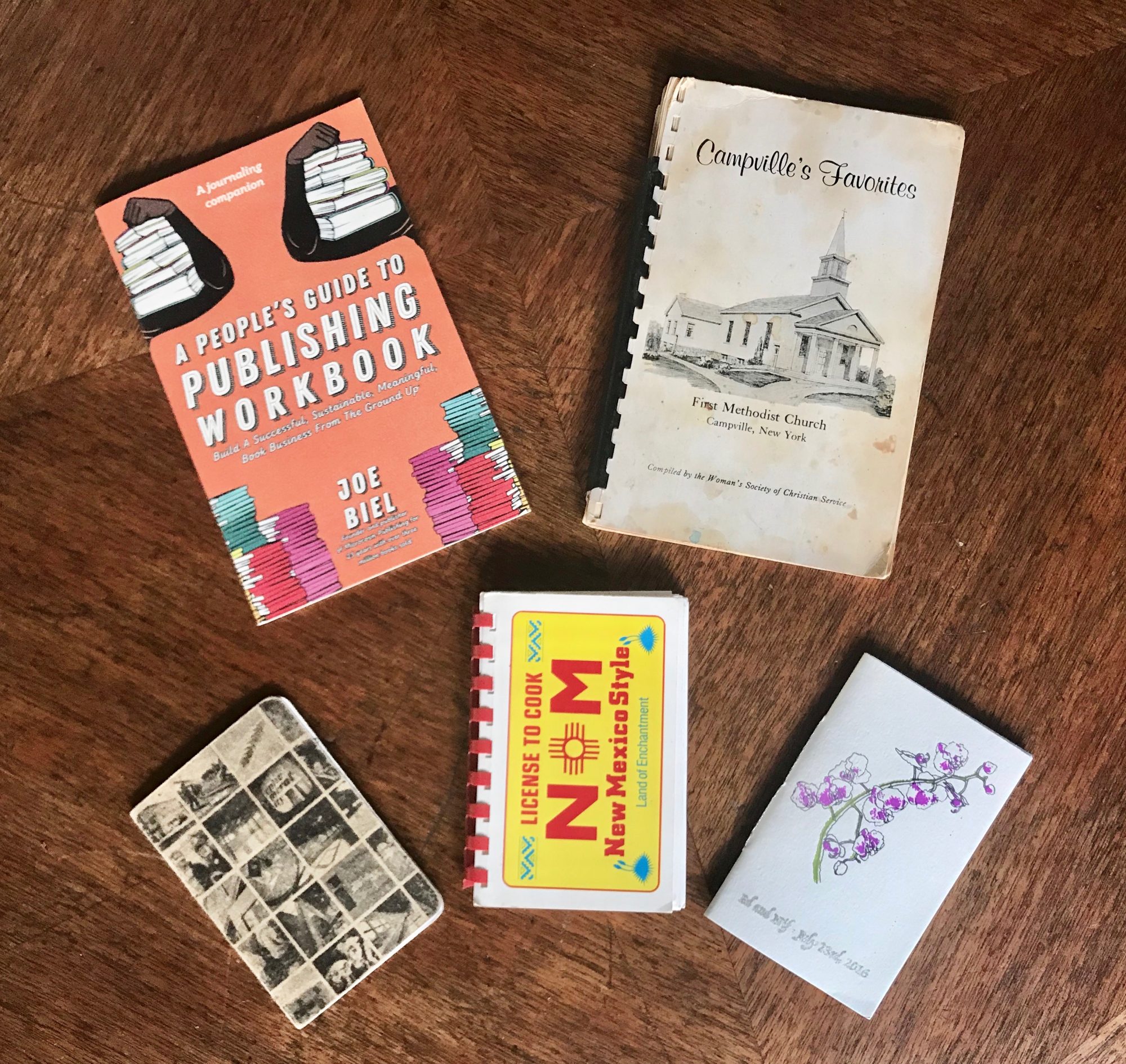
Have you considered making one of these? Perhaps as a chapbook, or a booklet, or even a spiral-bound collection? Not everything has to be perfect bound, which can be more expensive. However, in the age of Pinterest and Instagram, a three-ring binder with skewed, blurry, photocopied photos to give away just isn’t going to cut it.
After you decide on basics such as the length, the size, and the audience, you need to think about the whole look. Fear not! Higher standards can easily be met. Design is a big part of making your efforts look professional. Although booklet design is more than just picking a fitting cover image, it doesn’t have to be onerous or complicated, and it doesn’t even have to require specialized software such as InDesign.
According to Ooligan graduate and designer Bryn Kristi, you just need to follow the classic principle of KISS (which stands for “keep it simple, stupid”) by adhering to these guidelines:
- Keep it clean: Please, please, please ask someone else to proofread it for you. No one can ever find all the typos. And repeat this step once the booklet is printed.
- Keep it brief: The content should be as tight as you can make it, and copyediting is a must!
- Use consistent formatting: For example, if you choose to indent paragraphs, do this consistently. The same goes for how you style bulleted lists or how you refer to fractions: half or ½? Choose one and stick with it.
- Keep the interior font simple: Choose only one element for a title: bold or CAPS. Fancy fonts are for covers or other materials, like posters.
Other things to keep in mind:
- Make a dummy book or print out a draft! If it’s the same “section” (such as a long recipe), make sure it stays on facing pages so it doesn’t have to be flipped over. (Tip: odd numbers are always on right-hand pages.)
- If there are two brief items on one page, there should be a graphic element to differentiate them (e.g., a horizontal line, an image, etc.).
- More than ten pages? Time for page numbers! How big is the paper? (8.5″ x 11″
paper needs the page numbers to be printed in the outer corners for easier flipping and navigation.) Consider a table of contents for even easier use. - Graphics are good, but if you make sure they are high quality with decent resolution and lined up evenly on the page, it will make a much better impression. If you didn’t create them, it’s also important to know if they’re free. Here’s a source for royalty-free images.
- Think about your specific audience. Don’t just use a template if you don’t have to. If you do need to (hey, everyone runs into tight deadlines sometimes), try using basic word-processing software such as Microsoft Word or Google Docs, and refer to these guidelines. For example, does your font need to be larger for easier reading for a younger or older market?
For more detailed design tips, take a look at this previous Ooligan blog post, and don’t hesitate to do your own research on best practices for book design
Good luck on your basic booklet efforts, and please feel free to share images of
yours in the comments.