When most readers think of book design, they focus on the exterior aspects: the front and back covers, the jacket, the spine. Interior design is often overlooked and underestimated, and yet the work that goes into designing the words on the page is just as intensive and can be just as creative as the work that goes into designing covers. And just like cover design, different genres have different challenges and style trends for interior layout. The cardinal rule of interior layout is that the design must be invisible: the choices shouldn’t be so obvious that they distract the reader from the content of the book.
If you’ve ever browsed different genre aisles at a bookstore or library, you might have noticed some differences between cover trends: fantasy books tend to have a lot of shadows, with a dark color palette of reds and blues and greens, and feature mysterious figures or objects; while nonfiction often feature photographs relevant to the topic. For the purpose of this post, I’ll be looking at nonfiction, adult literary fiction, and middle grade fiction. Each of these categories have different audiences, which determine some of the factors in their interior layout.
Middle grade books usually feature interior layouts with a lot of empty space: bigger margins, bigger leading (space between lines), bigger font sizes. This is to make the books more accessible and easier to read for younger readers—to ease them into longer stories. The same leading and margins wouldn’t be used for adult books.
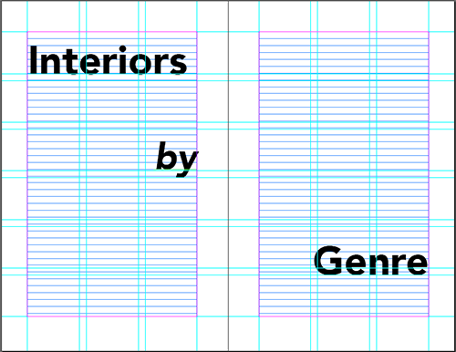
Layouts for nonfiction books vary depending on the topic and type. For example, memoirs and biographies are often designed in a similar style to fiction books: single column, chapters, etc. Sometimes they include photographs, either in a designated section or interspersed throughout. Guides and informational texts might have multiple columns, more often include photographs and charts throughout (with informational captions), and might have sidebars with additional information. Any book that includes photographs or illustrations should have a grid to help better place the images and image captions. InDesign will create grids based on your specifications, which are calculated in relation to trim size and margins.
Adult literary fiction can seem boring on the surface: there are rarely images to be arranged, and many novels don’t have chapter titles. However, this truly depends on the nature of the work and on the designer. For example, there have been a few recent adult literary fiction Ooligan titles that contain imagery. The most recent is Peter Donahue’s Three Sides Water, which contains a map of the Olympic Peninsula in Washington—where all three stories take place—and an image from a specific area on the title pages before each story. Since the setting of the stories plays such an integral part in each, we wanted to highlight that role and give readers an idea of the mood and region. Last year’s At the Waterline similarly relied on setting, and included a map of the area around the Willamette River, as well as a diagram of a sailing boat (to help those of us uninitiated in sailing). Adult fantasy books also frequently feature maps and other imagery, since many take place in fictional worlds readers aren’t familiar with.
Interior designers are the unsung, invisible heroes of book publishing. Many readers may not be able to point to a design they liked especially, but will often remember one they didn’t—one that failed to remain invisible.

