
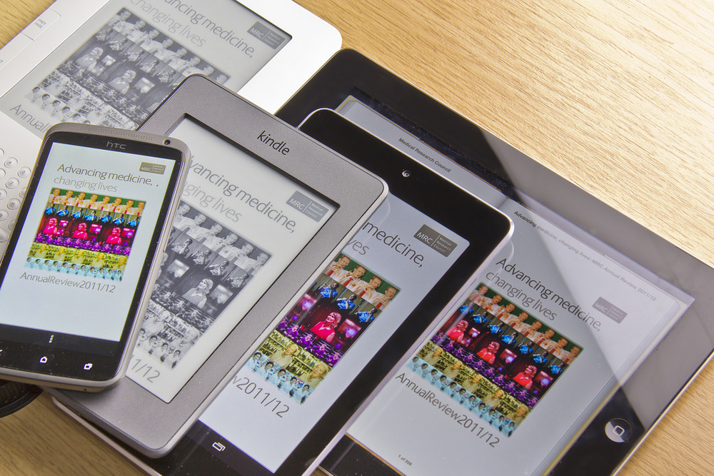
Ebooks and ebook technology have come a long way in the past decade. Gone are the days when ereaders were necessary to read ebooks; now, a reader can flip through the first chapter of an ebook on her phone in the morning and pick up where she left off on her computer later that day, with no data transfer between devices. The Cloud helps facilitate this transition, but the ebook’s reflowable layout is more important.
Reflowable ebooks resize themselves based on the viewing device. This is similar to adaptive websites, which alter their layout depending on the size of the screen used to view them. For example, the War and Peace ebook on your phone is the same file that’s on your computer; the only difference between the two is how the text is displayed. Fixed-layout ebooks, on the other hand, do not change based on the device used to view them (such as a PDF). Fixed-format layouts are good for books with large and frequent images as well as specific layouts without which the book would be unreadable (like cookbooks).
For the casual fiction or nonfiction book, a reflowable layout provides the flexibility necessary to display properly on the widest variety of ereaders. The problem with reflowable layouts, though, is the proper display. Readers can customize font, size, and alignment of the text in an ebook. So how can an ebook designer know what the proper display of an ebook is if everyone has different preferences? Traditional mandates of book design must be altered or ignored for ebook design, creating a conundrum for digital designers.
The most obvious issue is how to handle images. At 300 dpi, print-optimized images have a much higher resolution than web-optimized images, which have 72 ppi. Unfortunately, some ebooks use web-optimized images, which can become grainy at high zoom levels. Further, images that span two pages in print books often do the same in ebooks. If a reader wishes to examine a map in an ebook, she must zoom in on the first page, zoom out, flip to the second page, zoom in, zoom out, flip back, and so on. Some “illustrated” editions of ebooks use higher dpi images, but this practice is fairly uncommon (and expensive).
Another ebook design conundrum is the presence of widows (a paragraph ends with a short line on the top of a page), orphans (a paragraph begins at the bottom of a page), and runts (the last word of a paragraph is on a line by itself). While print book designers avoid these at all costs, ebook designers have no control over them. Because reflowable layouts change between devices, a widow on one device might not be present on another. Same with orphans and runts. So the designer (and the reader) has to live with these unsightly line breaks.
There are many layout foibles in reflowable ebooks, such as the lack of universal support for folios (page headers and footers), inconsistent number of lines on a page, and occasional missing indents for paragraphs. These, too, are out of the designer’s hands. That said, reflowable layouts are convenient and are supported by a wide variety of ereaders. In my mind, that’s a fair price for a few minor layout issues.