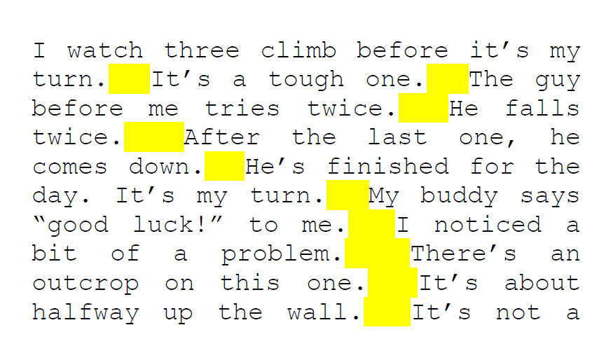
There are a lot of things that can make a book unreadable: the content, the prose, the plot holes. The list could go on and on. For me, nothing makes a book more difficult to read than badly justified type. When there are large gaps between words, I want to throw the book across the room, even if it is well written and interesting. The science behind how our eyes track when we read is fascinating.

Eye movements flowchart
In the journal article “Eye movements in reading and information processing,” Keith Rayner writes, “When reading English, eye fixations last about 200–250 ms and the mean saccade size is 7–9 letter spaces (see Table 1). Letter spaces are the appropriate metric to use, because the number of letters traversed by saccades is relatively invariant when the same text is read at different distances, even though the letter spaces subtend different visual angles.”

Eye movements in reading and information processing
If the spaces between words are too large, then it becomes a distraction for the reader’s eyes. Type that is not properly justified can turn readers away because the book is physically difficult to read. Readers will become frustrated and put the book down. It’s our job as editors, designers, and publishers to create books that people won’t stop reading.
Here are some things to consider when working with justified type:
Hyphenation
For books and longer works, hyphenation is crucial, and there is an etiquette that goes along with it. Just follow these simple steps:
- Leave at least two characters behind, and take at least three forward:
fi-nally, not final-ly. - Avoid more than two hyphenated lines per paragraph.
- Link numbers and equations with hard spaces.
These look like a regular space but won’t convert to a line break.
Line Length
Line length is an important aspect of designing type. The number of characters in a line can also affect readability. Have you ever been on a website where the text spanned across your entire browser? Did you read all of the information or get bored? I get bored! According to The Elements of Typographic Style by Robert Bringhurst, forty-five to seventy-five characters is industry standard for a single-column serif typeface layout. However, sixty-six characters, including spaces, is widely regarded as the best line length. More than seventy-five characters is too long for continuous reading.
Justification Settings
Make sure that your justification settings fit with your design. There are many different suggestions to make when it comes to settings. If you trust InDesign and are able to comb through afterward and make sure the justification is to your liking, then I would recommend these settings.

InDesign justification settings
Happy designing!

