
A book from Wave Books can be recognized from across the room. Their distinctive cover design relies on stark, black-and-white contrast and strong typographical elements. This look has set them apart as a small press that has a clear brand recognizable simply from their covers. Let’s take a closer look at how their aesthetic has come together over the years.
A book cover has several jobs it must perform simultaneously—it must serve as a marketing tool, offer a description of the content of the book, and be aesthetically pleasing. Wave Books predominantly publishes poetry, a notoriously difficult genre to design covers for. Rather than opting for a wide breadth of designs that would inherently be incohesive, Wave took an alternate route. Their design decision to have no illustrative or pictorial elements on their covers is a strong one, and frankly a dangerous one, since it makes portraying the contents of the book so much more difficult. This is where the reliance on typography and information hierarchy comes strongly into play.
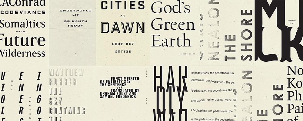
For example, Dorothea Lasky’s Milk has one of the few covers which employs a large, heavy typeface. This move is both aesthetic and utilitarian. The restriction of only using a typeface, no images or illustrations, with such a short title was an immediate problem. However, the themes of Lasky’s poems span a variety of weighty topics. The solution they found was to use a dramatic, old-style typeface and to allow the letterforms to bleed together to allude to the darkness of the book. In contrast, the curvatures of the letterforms bring some softness and motion to the design.
They went in the opposite direction for Rachel Zucker’s collection of poetry, The Pedestrians. The thematic elements of this book are meandering, sad, and solitary, all set in an urban environment. The cover design emulates these themes. The title and author are repeated in uneven lines across the cover in a utilitarian sans-serif typeface. The orderly, unadorned aspect of the letterforms lined up in such a manner gives a literal interpretation of the title; they appear to be little pathways of pedestrians passing each other silently on a crowded city sidewalk. The overall appearance of the cover is predominantly white, and this coupled with the minimalist typeface gives it lightness and anonymity. Yet again, the entire weight of the content is placed on the choice of the text, and the designer managed to sum it up without relying on any imagery.
These are only two examples of the wide breadth of typographic achievements Wave Books deserves credit for. However, there is another aspect to their loyalty to this style of cover design: brand cohesion. Book publishers are not commonly known for having a strong visual brand that spans their entire catalogue. Wave Books is one of the few widely distributed contemporary publishers that has adhered to this ideal. Regardless of whether this cohesive branding has a positive or negative effect on their sales numbers, it is important to acknowledge their efforts from a design standpoint. Their dedication to pulling this look off consistently is impressive and inspiring. Here’s to their future publications, and seeing what typographic moves they make in the future!