
The design department in a publishing press is absolutely one of the most important aspects in the publication process. Design furthers the production of a book by working on its interior as well as its exterior—the book’s cover or, in some cases, a jacket. The cover is the very first thing readers will see as they browse their favorite bookstores in search of their next binge. Although no one should judge a book by its cover, it’s okay (and completely human) to be guilty of this at one point or another. Unfortunately, this can make a designer’s job a little more strenuous as they want to ensure the book’s success and maximum potential—not only for the author, but also for the press. In order for the designers to create a successful exterior, they will need to take into account various characteristics of the written piece.
- Who is the target audience?
- What will catch the eyes of this audience?
- What genre does this book fit into?
- Who are the main characters?
- Is there a tone or mood the cover should portray?
- Are there any repeating symbols used in the book that can be used on the cover?
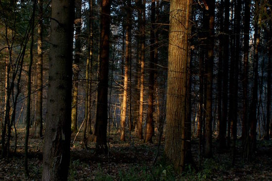
The list of questions can go on and on. Let’s take a quick look at Brian Catling’s The Vorrh, a literary fiction novel that’s been on Powell’s bestseller list for several weeks. The book takes place near the old town Essenwald, home to the vast and seemingly endless forest called the Vorrh. The forest is said to be inhabited by creatures of all sorts, including angels and demons, and is known to bend time and warp memories. A brave young soldier wishes to take on the Vorrh’s challenges in hopes of being the first human ever to wander through its branches and dense tree lines. Through his journey, he finds himself being the one hunted, encountering a cyclops raised by robots and a young girl with an awful sense of curiosity. In a novel with so much compelling imagination within its pages, the cover must encompass that creativity and beauty.

The Vorrh’s cover is centered around images of the different moon phases. They remain in a circular motion in order to adhere to the main character’s long journey through the depths of the forest, day and night. The soldier faces many obstacles and they are continuous, much like that of a circle. Furthermore, the cover follows a darker, more mysterious color scheme. The choice in heavy use of black and lightly tinted beige in the background identifies the darkness and blackness of the forest within and the fantasy dug deep in these pages. The actual title is not even used as the main source of design. It is conveniently placed in the bottom right corner of the book. This could be due to spacing and the desire for the moon phases to be the main attraction in the cover, but let’s say it’s placed there to signify that the Vorrh will not be the only thing you focus on while reading this book. Lastly, in the upper left-hand corner, there is a quote. Quotes on a cover are primarily used in order to show readers that this book will be worth the read.
The Vorrh successfully ties in several key characteristics of its novel and its audience in order to create an eye-catching cover that has helped it climb the bestseller charts. Without a design department, a publisher cannot flourish. Without a design department, an author may not have access to the creative minds behind successful covers. Without a design department, a book’s potential can only go so far.
So kudos to all those design departments out there and special kudos to the one at Ooligan Press—we appreciate you!