
In the field of publishing, how can publishers—who are rarely household names in the way that the authors they publish can be—stand out as trustworthy entities that produce reliable, quality books? The question for all businesses or organizations is a matter of branding, or the general outward image that an entity presents in order to solidify its own identity in the public consciousness. Branding can be as specific as strict rules on line spacing in public-facing written materials or as general as the tone they take on social media posts, but some of the most noticeable branding is the visual style adopted by any given company or organization. The nature of the organization in question will determine what style to take, so how do publishers (who are known primarily for producing words) go about establishing a recognizable visual brand?
A good place to start is with a logo. The logo is meant to be a visual representation of the publisher—a brand in the traditional sense of the word, like the kind marked onto cattle by a rancher—to signify that a book or social media artifact belongs to Ooligan Press. To be effective as a marketing tool, the logo should be attractive and relatively simple but recognizable and distinct from other iconic logos. For Ooligan, that logo is a fish hook, which harkens to the ooligan fish that the press is named for and that evokes the imagery of various Pacific Northwest wildlife and outdoor activities. (Ooligan’s previous logo was a drawing of an ooligan fish itself, though this image was perhaps a bit too detailed to function effectively as a brand logo.) This hook is included on our promotional materials to denote not only that the material was produced by Ooligan Press, but to evoke the spirit of the Pacific Northwest present in our books—a broad concept communicated by only this small, simple image.
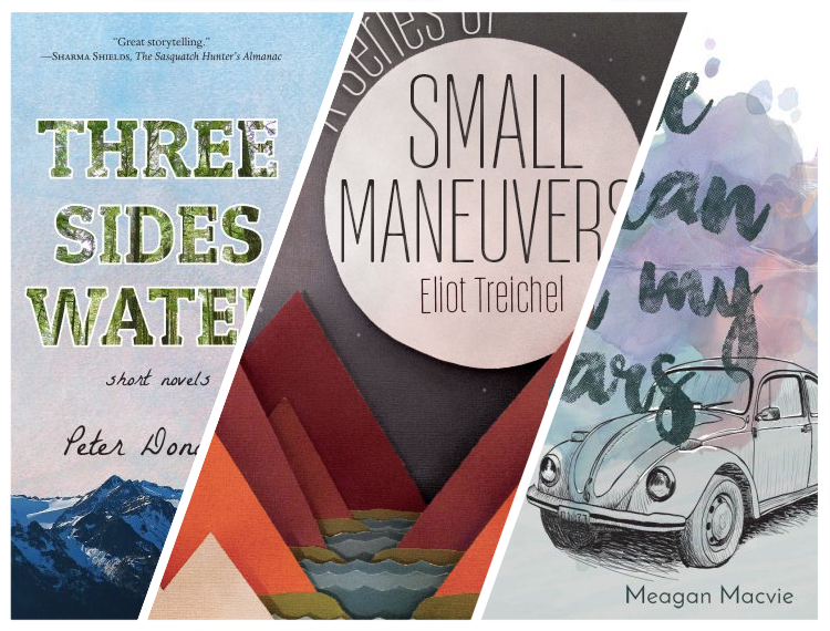
Publishers know that books are judged by their covers, and Ooligan’s visual aesthetic is vital to our brand, from that little hook to our full book covers. Our press maintains an internal Ooligan Aesthetic document meant to aide our designers in keeping with our visual brand. This guide lets designers know what elements they should incorporate or avoid in order to give all Ooligan covers, social media artifacts, bookmarks, and other images a consistent look. The guide defines Ooligan’s look as do-it-yourself and handcrafted, and designers are advised to utilize clean lines without giving their designs a sterile look. Along with the DIY style, our covers often include images of mountains, forests, and rivers, evoking the Pacific Northwest theme of our titles with our aesthetic brand. Even before readers notice the Ooligan hook on the spine, they often recognize the arts and crafts style and blue and green color palettes for which Ooligan book covers have recently become known.
While variety keeps our covers and other materials relevant to the rest of the publishing industry, visual branding is essential to communicating our identity and values as a press clearly but subtly in everything we publish.