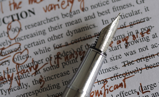
I began working as an editor for the Portland State Vanguard, PSU’s student-run newspaper, over the summer, and while there are a variety of similarities between editing books and newspapers, the steepest learning curve I encountered was in the differences in house editing styles.
It might sound odd if you’re not already an editor, but the differences in style guides at publishing houses can be a tedious affair if you’re not at least a bit fluent in the main English-language house styles.
Like most book publishing companies in the US, Ooligan Press mostly adheres to the Chicago Manual of Style when it comes to editing decisions. Grammar, punctuation, diction, and more: all of these details are often decided by whatever the most updated of CMOS states. At the Vanguard, though, we use a variation of AP Style, similar to what most national papers often use.
One major difference between Chicago and AP is how numbers and number-centric icons are rendered. For example, on actual numbers themselves: In Chicago style, the style I “grew up” with, all numbers below one hundred are written out. However, in AP Style, all digits (0–9) and the number ten (10) are written out, while anything higher than those would be written in their numeral form.
LeBron James scored ninety-three points last night. (Chicago)
LeBron James scored 93 points last night. (AP)
Another instance that tripped up a neophyte editor like myself was the assortment of differences between how ellipses and em dashes are rendered in each respective style. AP Style often calls for one space followed by three consecutive periods and another space, as opposed to a space between all periods in Chicago style. This difference is best understood with an example:
I’m sleepy . . . but ready to hit the road. (Chicago)
I’m sleepy … but ready to hit the road. (AP)
To compound this editorial burden, the Vanguard closes spaces before and after words.
I’m sleepy…but ready to hit the road. (Vanguard house style)
I can tell you firsthand that the reason for these decisions usually has to do with space on a page; there simply isn’t enough room for all of the content sometimes. What this taught me was to closely examine whatever medium you’re working in as an editor. Is what you’re editing going to be read on large newsprint with small text? Will it be published online or in print, or both? Understanding why publishing houses choose to customize their style guides often depends on what exactly the publisher plans to print.
Titles in print are published in different ways, again depending on the house style the publishing house uses. Quick examples using television titles:
“Stranger Things” (AP Style)
Stranger Things (Chicago)
At the Vanguard, we’ve recently opted to go with italics for all television titles—same as Chicago. Again, this has to do with the concept of space, or rather, conserving as much as we can on the page. If we at the paper went back and forth between using AP Style most of the time and using Chicago when it’s convenient, you would end up with an inconsistent looking newspaper.
Ultimately, becoming fluent in both Chicago and AP Style will help a new editor build a professional skillset readymade for the freelance world. Being able to work in both frames of mind will not only expand your career prospectives but also train your eyes and brain in a sharp, rigorous way.

