
One of the most important aspects of design is knowing if it will be presented digitally or in print. Knowing how a design will be presented affects several design elements, so it is crucial to be aware of your options. In today’s digital world, a lot of designs are created to be displayed on a screen. Those who like to create digital art and manipulate images for online use tend to be more familiar with things such as aspect ratios, RGB (Red, Green, Blue), and pixels. These are concepts that are useful in the computer world, but they have different counterparts in the printed world. When designing for printed projects, designers need to be familiar with bleeds, CMYK (Cyan, Magenta, Yellow, and Black), and trim size. While it is possible to create a design without deciding whether it will be used online or in print, it will save a lot of time and energy if this decision is made before beginning a design project.
Once a decision has been made about whether a project should be designed for digital or print, it is time to open your design program of choice. Adobe InDesign is generally seen as the publishing standard; however, the current Creative Cloud requires a monthly or yearly subscription. There are other design programs that are free, such as Scribus.
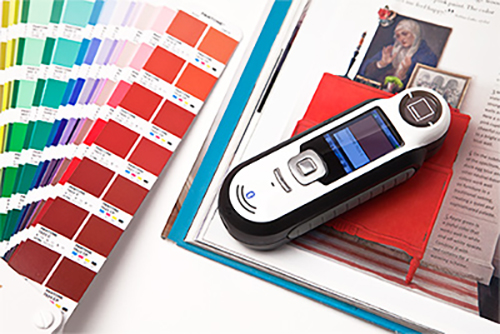
One of the first things you will want to do upon opening your design program is choose which color scheme you want to work in. If you are doing a digital design, you will want to work in RGB. RGB is used for digital designs because computer screens use colored light to display colors. RGB colors are additive colors, which means that when added together, they create other colors, ultimately achieving white when all the colors are mixed together. When designing for print, you need to use CMYK. CMYK colors are subtractive because when you subtract all the color you are left with white, but when you add them all together the colors make black. While these color options may not seem like a big deal (color is color, right?), and it might not be for digital projects, using CMYK for print will make a huge difference in how your color appears once it has been printed.
Another major consideration for design projects that can be affected by your final presentation is font choice. Due to the quality of the printer you use, or the resolution of the screen you will be viewing your final design on, you need to be careful of your font choice. Serif fonts are defined by their serifs, or the small decorative lines attached to the end of each stroke in a letter or a character. If your design will be viewed on a low-resolution screen or printed with a lower quality printer, serifs can appear blurry and make the overall text less readable. Sans-serif fonts are often better in lower-quality situations due to their clean and simple appearance.
The beauty of working digitally is that you have the opportunity to view your digital design almost exactly as it will look when it is displayed on a screen. However, when you are working digitally on a design that will be printed later, it is important to do a test print to make sure everything prints the way you want it.