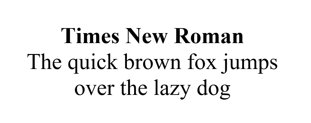
I went to a résumé workshop a few years back. I showed the workshop leader my pitiful excuse for a résumé, and she said, “Times New Roman is a little old-fashioned. Try using a sans serif font.”
I was shocked. Don’t use Times New Roman? But this is my résumé—it’s supposed to be official! Every teacher I ever had told me to submit papers typed in Times New Roman, twelve-point font, double-spaced; I assumed it was the end-all and be-all of professional typefaces. Times New Roman was so ingrained in my being that the idea of using another typeface hadn’t even occurred to me. This got me thinking—where did Times New Roman come from, how did it gain such prominence, and what role does it play in an age of increasing digitization?
Times New Roman can trace its origins to a simple challenge. In 1931, a typographer named Stanley Morison criticized The Times for their stodgy, old-fashioned choice of Didone typeface. The esteemed London paper asked Morison if his typeface design company (Monotype) could do better. He collaborated with The Times draftsman Victor Lardent to create a typeface that was easy to read and could accommodate the maximum number of words on a newspaper page. Lo, Times New Roman was born. The Times ran their first paper with the new typeface on October 3, 1932, and held exclusive rights to it for a full year before sharing it with the world.
Since The Times was one of the most respected newspapers in the world, its use of Times New Roman meant something. Other periodicals followed suit, including Woman’s Home Companion in 1941 and The Chicago Sun-Times in 1953. Times New Roman went on to grace the pages of books despite The Times‘ assertion in 1932: “It is a newspaper type—and hardly a book type—for it is strictly appointed for use in short lines—i.e., in columns.” Through the decades, Times New Roman became the standard typeface for print—legible, reliable, distinguished.
Of course, Times New Roman didn’t end typography design. Just as The Times‘ Didone font was deemed old-fashioned in the last century, so is Times New Roman old-fashioned in this one. As digital media becomes more prominent, other typefaces have a chance to step up. Though serif typefaces (Times New Roman included) are ideal for print, sans serif typefaces are widely considered easier to read on on the screen. When browsing your favorite online news sources, you’re more likely to see Arial, Helvetica, and other sans serifs. The Times doesn’t even use Times New Roman anymore—instead, they use Times Classic for their body copy and Times Modern for their headlines. You might say, “The times they are a-changin’.”
So where does that leave the rest of us, who are just trying to make our résumés look good? If you’ve typed a paper recently, you know that Times New Roman is still the standard in academia. As long as your professors specifically request Times New Roman, you’re best off using the classic typeface for assignments. When it comes to your résumé or your new blog, however, feel free to branch out—there are many excellent typefaces out there.

