
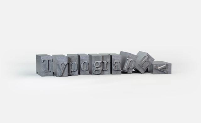
Good typography can make anything look good, but it can be hard to successfully pair your fonts. Creating contrast is the key to good font pairing. You can achieve contrast in many ways, and it is a lot simpler than you think. Here are a few tips on how you can successfully pair fonts without needing a degree in graphic design.
Use Different Weights of the Same Font
The easiest way to ensure that your typography choices look good together is to use different weights of the same font. You choose one typeface, and then utilize the different weights of that typeface to create contrast. A great example of this is using a bold weight for the header and a regular weight for the body. This method also creates consistency in your document/design because everything looks similar, but it’s just different enough to create contrast.
Use a Serif with a Sans Serif Font
A classic example of contrast is pairing a sans serif font with a serif font. These fonts compliment each other because sans serifs tend to be visually undetailed, while serifs have more visual detail. Another way to do this is to pair a script font with a serif font,
or a display font with a sans serif font. It is the balance of the visually detailed fonts with the less detailed fonts that makes these types of pairings successful.
Don’t Pair Fonts That are Too Similar, but Don’t Pair Fonts That are Vastly Different, Either
Pairing two fonts that look too similar is not a good choice because there is not enough contrast between the two. Fonts like Times New Roman and Georgia do not look good together because it’s difficult to tell them apart. At the same time, pairing two fonts that are too different can also backfire because the fonts express a confusing message when used together. Think of it like this: you wouldn’t match an old-western looking font with a sci-fi or modern font, would you?
Sometimes the Only Contrast is Size
Playing with different sizes of the same font is another simple way to create contrast. The trick is creating enough contrast between the sizes so that your information really stands out. Using a 24-point header and an 18-point body text might not create the emphasis that you are looking for, but a 36-point header with an 18-point body text will because there is more of a difference between the sizes, which creates a clear hierarchy of information.
You do not have to be a graphic designer to make beautiful and professional designs. Good typography can turn an okay design into a beautiful design with a few simple steps. You can utilize these steps for any type of document or content, whether it’s a resume, wedding invitation, or a book cover. Good typography signals authenticity, and it is an easy way to make anything look better.