It goes without saying that typography is an integral part of our everyday lives. We’ve also become accustomed to an onslaught of visual material, both in our digital lives and out in the real world where typography is used both functionally and nefariously. Highway signs and way-finding aids are used ubiquitously in our twenty-first century landscapes and have certain standards that are unique to specific regions. According to researcher Philip M. Garvey at Penn State’s Larson Institute of Engineering, the United States Federal Traffic Signs Regulations indicate that, “with the exception of destination names, all signs must use only upper-case letters. For destination names (i.e., places, streets, highways) using mixed-case legends, the lower-case loop height should be 75 percent of the upper-case height.” Specific research has been done in order to determine proper sign detection and legibility, usually having to do with the reflective materials being used, contrasting levels of letterforms against light or dark backgrounds, and font usage, spacing, and weight.
If typography is out in the wild, it will demand your attention whether it’s effective or not. Even unsuccessful attempts at public graphic design grab the observant onlooker’s gaze. If we continue with this line of thought, we can infer (with the help of Garvey) that “the ability of a driver [or pedestrian] to detect and read a sign is a function of numerous human, environmental, and design factors with complex interrelationships.”
Besides advertisements, which target specific consumer demographics and economic capital to prove successful, there is another graphic style out in the wild with a wide-ranging reach and scope: graffiti. Lindsay Bates, student of cultural heritage and architecture, describes that “graffiti writing has a very specific aesthetic: it’s about the tag, it’s about graphic form, it’s about letters, styles, and spray-paint application, and it’s about reaching different locations.” As graffiti and street art have become more widely accepted (and commodified) in mainstream culture, it’s useful to examine the ways in which this insular and notoriously underground subculture has affected our ideas around type design.
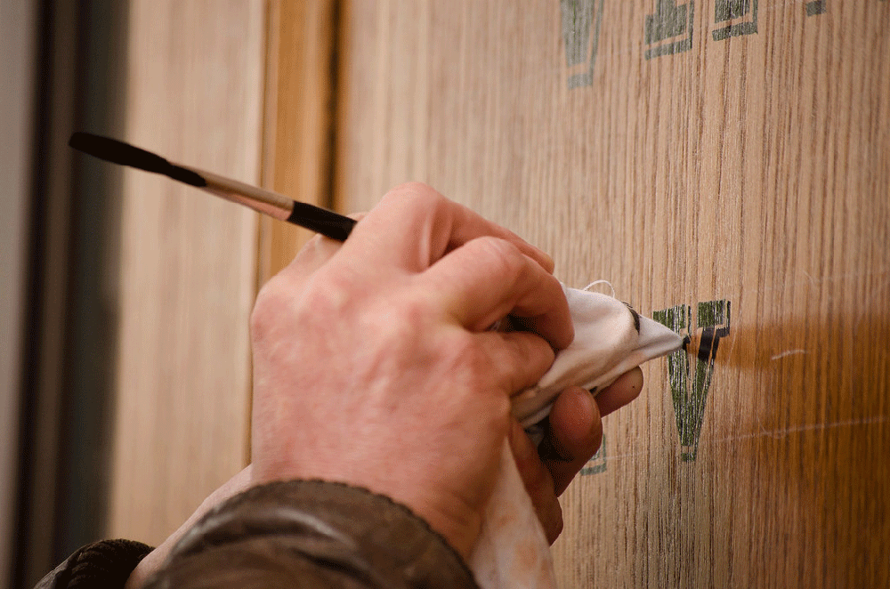
According to the Adobe Blog, the most popular typographic trends of the previous year (2019) include large, bold san-serif fonts that demand attention and improve legibility for brand names or as a graphic center piece for a design. We can return to Garvey’s research on contrast to follow similar trends in high-contrast fonts that employ heavy stroke weights and limited negative space to provide added impact: “The photometric characteristics of the sign, including the internal contrast, luminance, and light design, can also directly impact how well a driver sees a sign.” There is also continued interest in script fonts and letterforms that appear hand-painted or drawn stemming from the work of Stephen Powers, a forefather of graffiti who gained notoriety for his series of public, hand-painted murals titled “A Love Letter For You” dedicated to the citizens of Philadelphia, Pennsylvania.
With an increase in digital tools for graphic expression, the future of typography includes sculptural and 3D experimentation with new levels of dynamism using motion graphics and kinetic coding and mapping. We are part of a special time and place here on Earth where nostalgia butts up against innovation, simplicity interwoven with nuance and surprise, all happening simultaneously.

