
How do you unify a collection of essays by twenty-five different contributors (plus an introduction by the editor)? First, acquire pieces that fit the central theme of the anthology. Next, focus on bringing harmony to dissonant writing styles in the copyediting stage. Lastly, bring visual cohesion to the manuscript by establishing a uniform aesthetic. This step is the interior designer’s responsibility. Like the hours and hours spent by an acquisitions team and copyeditors, the time and energy an interior designer puts into a book isn’t glaringly apparent to most readers (unless the designer did poor work). If all three parties do their job, readers will give nary a thought to the process behind the book in their hands.

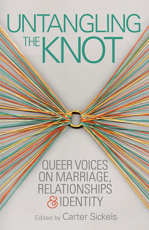
I recently completed the interior design of Untangling the Knot: Queer Voices on Marriage, Relationships & Identity, an anthology of LGBTQ essays edited by Carter Sickels that is coming out in February 2015. I’m excited for the release of this book for many reasons, one of them being that I designed a book that’s going to be on real bookstore shelves and read by real people(!). Another reason, of course, is that the book contains an amazing collection of essays collected and curated by Ooligan Press students. If you pick up a copy and don’t think twice about the interior design, then I will consider it a job well done. Allow me to go into detail about the details you may not notice.

Interior designers don’t start out with much. They are given a trim size, an approximate page count, and a copyedited version of the book’s content. If there are images in the book, the interior designer will get those as well. From there, many seemingly insignificant but very important decisions need to be made: What font will be used for chapter titles? What font will be used for the body text? How large should the margins be? Where should the page numbers go? How much leading is required for the text to be legible and readable? (Leading is the technical term for the amount of space between lines.) Each decision leads to a slew of new questions, much like chopping off the head of a hydra and seeing two more heads appear in its place. Once the font for the chapter titles is chosen, the designer needs to consider where the chapter title should be placed on a page, what font size should be used, and how much space there should be between the chapter title and the first paragraph. Decisions made at this stage are rarely definite; a designer will need to adjust many elements on a page for the text to fit nicely.

When designing Untangling the Knot, I aimed for a clean, simple look to compliment the lovely, minimalist cover designed by Stephanie Podmore. I used several weights of the Univers typeface (which is used on the cover) in the interior design to give the book a cohesive look from front to back. Since the contributors to this collection come from all over the gender spectrum, I chose Minion Pro, a font that doesn’t “read” as a particular gender, for the body text. From there, laying out the text was like playing Tetris with words. Once the interior was properly formatted, I checked to see that the white space between sections was consistent and I made small spacing modifications to lines and paragraphs of text so that everything would fit neatly on the page (known as adjusting the tracking and kerning). As soon as I get back the proofreaders’ notes and make the necessary changes, what I see on my computer screen will look just like what readers will see when they open up their copy of Untangling the Knot.