
In the age of information, the average person consumes gigabytes upon gigabytes of information per day—up to 34 gigabytes, according to UC San Diego’s estimate. That’s 100,000 words, 11.8 hours (spent mostly in front of a screen), and roughly twice the memory capacity of an iPhone. Competing for the oft-divided attention of your audience can be daunting in this environment. Infographics, which incorporate a visual element into the presentation of data, are an excellent way to attract your audience and present your information in a meaningful and productive way.
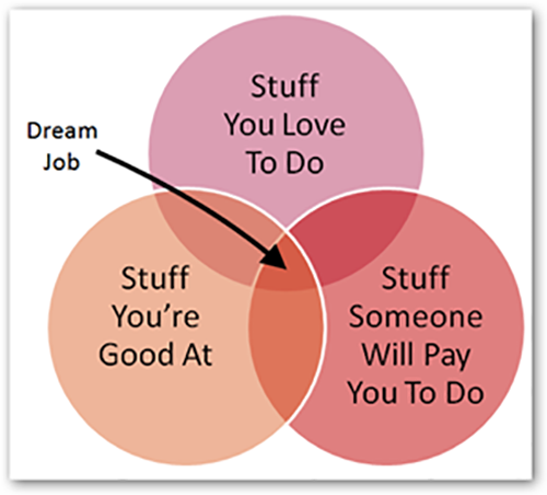
With an organized and well-designed infographic, you can transform even the most unwieldy data sets into bite-sized, easily consumed pieces of information. (Slice of pie chart, anyone?) Infographics come in many shapes and sizes, from the simplest of Venn diagrams to the most complex technical guides. They can be an especially useful tool to share a range of information with a large group of people who have different levels of knowledge about your subject.
If you’re just getting started, here are a few tips for creating an effective infographic that your audience can engage with, relate to, and learn from:
Color-code! Color-coding your infographic will help readers to quickly identify your data’s organizational structure. They will literally be able to see the relationship between the various elements you may choose to include in your infographic, such as data sets, diagrams, text sections, and conclusions. This visual structure is especially useful for instructions and guides, which may also contain multiple steps or stages.
Get graphic! Use graphics to draw your audience’s attention to important details that might otherwise be lost in a block of text or a page of numbers. Make your data meaningful by displaying statistics in colorful graphs and charts that get straight to the point. Whether you’re comparing two stats or ten stats, using graphics will help your readers to visualize the information at hand and understand the context of your data.
Illustrate your findings! Don’t be afraid to get creative! Infographics are a fun, artistic way to display and share information. Your initial audience may be more inclined to like and share an infographic with a sharp point and a clever design that invites the curiosity of wider social circles. Simple illustrations and designs that embellish your data and further emphasize the infographic can work in your favor.
Chart your conclusions! Research is always the key to a successful infographic. Check and double check your results. Make sure that your conclusions are well supported and that your infographic accurately reflects the information you’ve collected. In the end, your audience should be able to follow your logic and pick out your thesis—not because it was a color-coded artistic masterpiece, but because your data supports your conclusions. An effective infographic will guide the audience through all of the available data and lead them to the best possible results.
If you’ve done your research and you’re ready to assemble a beautiful, functional infographic of your own, there are many excellent online resources to help you get started. Online services such as Infogram and the user-friendly app Piktochart allow you to create and customize infographics in diverse formats, including Venn diagrams, bar graphs, pie charts, and flow charts.