
As someone who generally finds social media cluttering an ill replacement to social interaction (sorry everyone, I’m one of those guys), I took a stance to all but remove myself from most platforms. However, I kept Instagram because I found value in transcribing all these words, rants, complaints, and little odes into a photo of a damn good breakfast or how my dog looks at any given moment of the day. Instagram is simple; a minimalistic visual diary that encapsulates a huge world (Google told me that this year, 2016, there are 400 million users).
Besides the enjoyable mundanity of capturing a picture-worthy eggs benedict or your freshly painted toenails to showcase for the cyber-world, it has been interesting watching the analog nature of the book encapsulate and rock the digital world. Some recent campaigns to take hold have been
Bookface Friday brought to life to support libraries and Book Bento Box hosted by Read It Forward (give those hashtags a search and tell me you don’t have the itch to participate). These campaigns are so noteworthy based on the extent of popularity it has reached and how two smaller institutions have revamped the entire tangible nature of the book in an appealing and fresh look for social media. The digital world calls for a visual medium. No sense in denying it.
I’ve noticed that the majority of publishers who are jumping on the visual bandwagon are the majority magazines or publications more recently updated (check out Vogue, National Geographic, New York Magazine). Their visual imagery is fluid and eloquently branded to their missions and aesthetic by demonstrating storytelling in a visual unity of cohesion. In a world where the most novel and relevant information is pertinent, I understand where there may be difficulties for a smaller press, like Ooligan, to continuously have visual imagery to showcase without it becoming redundant.
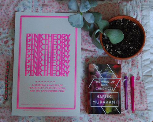
Working on the Siblings team, we’ve begun creating visual artifacts and marketing collateral for many social media platforms, in my case the one and only, Instagram. We’ve made a point to create these visual artifacts with a solid branded look in hopes of creating a marker of the publication; from typeface to color scheme. Recently, I’ve worried that we are missing something significant–shouldn’t the main focus be to work on representing Ooligan and what the press, as a whole, has to offer?
As Ooligan moves forward with a more detailed strategic outline for using Instagram, and all of the social media platforms, I think it’s important to wholeheartedly focus and develop digital imagery, hashtags, for how we want Ooligan represented and admired. It’s time we show the world that we can “wield more than words alone.”