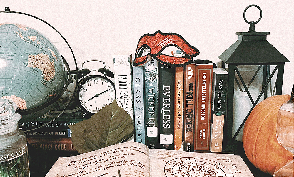
Book lovers, take a look at your shelf. What do you see? Not all of us can be Bookstagram stars with a plethora of breathtaking displays, but recently I’ve discovered that my books seem to follow a very similar color scheme. At first I thought this was a happy coincidence, but it turns out that publishers definitely know what they’re doing. In the book publishing world, marketing all begins with the cover.
A book’s cover is its most powerful marketing tool: it serves as a poster for the book and gives the consumer an idea of its contents. Whether we like it or not, we do tend to judge a book by its cover. One of the first things designers take into account when developing a cover is the color palette. While many artists are free to choose whatever shades they’d like to feature in their work, book designers must consider the marketing aspect of the cover. It is common practice for publishers, including Ooligan Press, to generate a list of successful titles within the same genre of the book to discern similar color palettes, design trends, and typefaces. The idea is that a reader will most likely associate the new book with a book that they’ve previously enjoyed. The power of recognizability within the intended market can be a powerful thing. According to Yu and Ahn’s study on the correlation between marketing and visual cues, delivering what a customer expects elicits positive reactions and increases the likelihood of purchasing the product.
For instance, if you’re like me and love a good fantasy title, you’ll notice that your bookshelf probably contains many shades of blue, grey, and black. A study conducted by Labrecque and Milne from the Journal of the Academy of Marketing Science shows that these colors tend to symbolize dignity, power, and mystery—all of which are elements in fantasy books. On the other hand, romance titles tend to utilize pastels with pops of bright, vivid colors. These shades symbolize sincerity and warmth, which are also indicative of the genre.
A book’s cover also comes down to how it is designed. In some cases, such as thrillers or memoirs, it’s encouraged to use photography as a foundation to establish that connection with the reader and the real world. But in genres such as fantasy, photos are rarely used on the cover because they take away from the audience’s imagination of the fantastical settings or characters. In those cases, digital illustrations are often preferred to capture that magical element and preserve mystery.
Recently, I read a romantic comedy book set in Singapore. The first thing I noticed was the cover’s minimalist vector art style in bright colors, which was almost identical to the Crazy Rich Asians series by Kevin Kwan. I picked up the book because I thoroughly enjoyed Kwan’s trilogy. The publisher definitely meant to catch my attention and—spoiler alert—it worked. It’s sitting on my shelf right now, in its happy home next to its Crazy Rich Asians cousin. I am a walking example of the efficacy of this book marketing technique and honestly, I don’t mind it. If it leaves me with a colorful array of books in all my favorite genres, I might just be on my way to becoming a Bookstagram star after all.

