
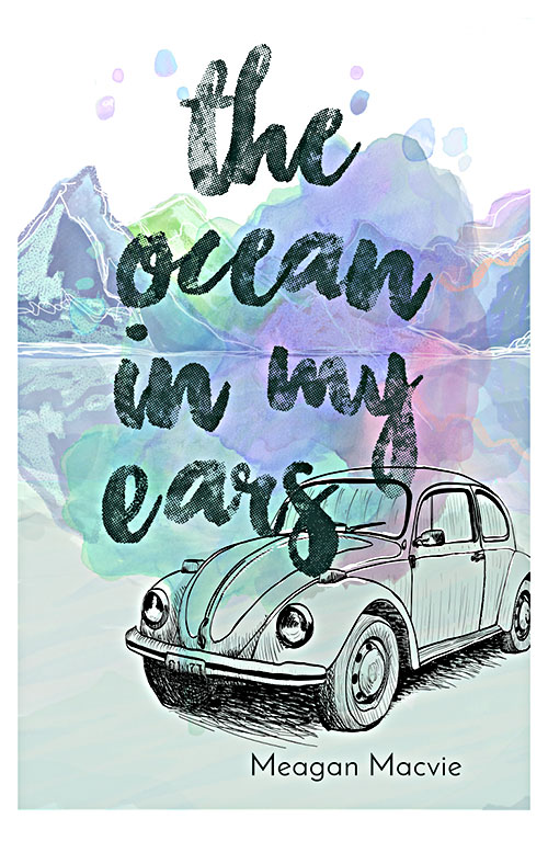
The last time you heard from the Ocean in My Ears team, we were busy copyediting the manuscript. Well, now the copyediting is finished, and we have since turned our attention to the cover. Like many of our projects at Ooligan Press, this was a collaborative effort. Taylor Farris came up with the original concept for the cover that featured a watercolor splash, a denim textured font, and a clean aesthetic; Leigh Thomas built upon this design, adding the mountains and the reflection, as well as fine-tuning the details; and Riley Pittenger hand drew the illustrated car. Needless to say, the result is a cover that is more than the sum of its parts, but let’s go ahead and take a closer look at some of those parts anyway.
The first thing you might notice is that the background is white, which gives the cover a kind of lightness that mimics the voice of our protagonist, Meri Miller. The white background is echoed by the white lines on the mountains that hint at snow and an Alaskan setting. This is really important because while the setting is integral to Meri’s story, this book is not a wilderness adventure. At this point, you might be thinking a little about color theory and what colors can express. The renowned graphic designer Chip Kidd once said, “Colors communicate in ways that words just can’t. This is very, very hard to explain, and that’s the whole point.” Nonetheless, let’s continue thinking about the colors of our amazing cover.
The color splash primarily utilizes cool-toned colors—colors which are often used to indicate cooler temperatures and that simultaneously echo the bright colors popular in the early 1990s when The Ocean in My Ears is set. The font utilizes a simple black along with a denim texture in reference to the book’s 1990s setting when denim skirts, jackets, overalls, and even denim print leggings were popular. Typography is a study unto itself, but the lowercase title is less formal, thus indicating intimacy and a teenage protagonist.
The inverted reflection adds visual interest to the watercolor splash, draws the eye, and suggests both the water of the ocean and two ways of seeing the setting. This is fitting because throughout the book, Meri oscillates between embracing the comfort and familiarity of her small town and wanting desperately to escape it. Similarly, featuring an illustrated version of Meri’s car on the cover suggests that this book revolves around a journey of some sort, but by using an illustration rather than a photograph, there is room to wonder about the type of journey that takes place. Wonder is really what a good book cover should elicit—it is, as Chip Kidd affirms, “a distillation. It is, if you will, a haiku of the story.” We are thrilled with this cover and hope you love it as much as we do.
Next up: XML coding, designing the interior, developing marketing plans and social media strategies, and the general multitasking that comes with publishing.
Oh, and if you haven’t already, make sure to connect with the brilliant Meagan Macvie on her website at meaganmacvie.com