
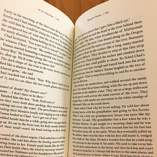
Over winter break, I designed the interior for Ooligan Press’s latest novel, At the Waterline. While I was home, I tried explaining the interior design process to family and friends and was met with a string of nods and blank stares. Honestly, it happens a lot. Designing the interior of a book is a complex, detail-oriented process—from picking the right font to fixing the widows and orphans. But it’s not as bad as it sounds.
Having worked on At the Waterline for close to a year, I became familiar with its many versions, as well as Brian K. Friesen’s writing style and nuanced characters. I looked for fonts that blurred the line between being modern and old school in how they were shaped. I finally settled on Bell MT, a rounded and thin serif font. I went through five or six mock-ups with different fonts. The more I stared at the fonts, the more they looked similar and the less I liked them. Bell MT works with At the Waterline because it strikes a balance between being bold and subtle, much like the story. After choosing a font, it was time to do the actual layout of the manuscript.
We use Adobe InDesign to format manuscripts, which are XML coded in TextWrangler prior to being imported into an InDesign document. This makes it easier to apply paragraph styles. XML coding saves time and prevents possible mistakes by linking the codes with the paragraph styles that are custom-made for the book. Paragraph styles are exactly that, styles that are added to the paragraphs to allow for easier reading. They prevent the text from being one giant block.
I wasn’t left to my own devices, though. There was a mock-up phase where I made different designed versions of the pages. They consisted of different fonts, paragraph styles, folio styles, and any other design features. After going through a round of feedback, I made changes, narrowed down the designs, and decided on a final version. I went through five or six mock-ups to decide on the layout. For the folios, I wanted to veer away from traditional formatting—book title and author name at the top and page number at the bottom. I experimented with putting the folios on the side, but it didn’t work out the way I wanted. Instead, I ended up centering the author name at the top of the recto (right-hand page) and centering the book title and page number at the top of the verso (left-hand page). The verso folio looked something like this: “At the Waterline | 7.”
Applying paragraph styles took a bit of time because finding the right font size, leading, and margin spacing is a process of trial and error. The number of words on a line should not exceed sixty-seven characters; otherwise, the line is too crowded and the brain doesn’t focus. Ellipses need to be changed to glyphs to allow for the correct spacing. Spacing needs to be altered to fix any rivers (the distracting white space that runs down a page). Then the widows and orphans need to be removed. It sounds bad, but it’s not. Widows are single lines of text that are left behind at the bottom of the page, and orphans are single lines of text that are left at the beginning of the page. After I finished designing At the Waterline, it was sent to the editorial department for proofreading, prior to being made into a galley (or prebook, as I like to call it).
Everyone knows about cover design because it’s what people think of when they look at a book, but interior book design is what the reader stares at most. It takes a lot of time and effort to design the interior of a book. The designer’s job is to format the interior in such a way that the reader is unaware that is was even designed. It should not be intrusive to the reading process. Next time you pick up a book and open it, admire the hours of work it took to make it look like that. Then get mad that the designer didn’t fix the widows and orphans.