
“The cover of my Book of Scotlands (2009) is emblazoned with the motto: ‘Every lie creates a parallel world. The world in which it is true.’ One day, searching for Suhrkamp covers (I love the didactic restraint of their postwar design), I stumbled on just such a productive lie: graphic designer Hagen Verleger’s ‘Project Suhrkamp,’ in which he imagines a series of fresh covers for the revered publishing house. Like all the best design, Verleger’s work—systematic and yet sensual, austere but playful—proposes an alternative world in which things could be radically better, and asks us to imagine the conditions under which his lie might become truth.”
This is how Nicholas Currie (also known as Momus), writing in Frieze, introduces Hagen Verleger’s “Project Suhrkamp,” a personal project in which the book designer reimagines the cover designs for a number of book series published by the German publishers Suhrkamp and Insel. Verleger’s alternate Suhrkamp rejects the use of images on book covers and finds other means by which to make books compelling and beautiful. I interviewed Verleger to better understand the design thinking that went into Project Suhrkamp.
Kento Ikeda: What inspired Project Suhrkamp?
Hagen Verleger: Sometime in 2004, Suhrkamp, a major German publishing house, changed (or rather: completely abolished) some of their then-legendary book cover designs, many of which were originated by Willy Fleckhaus during the 1960s and 70s when Siegfried Unseld was Suhrkamp’s publisher. The way that these redesigns came about and were received (poorly, that is) inspired “Project Suhrkamp”—which essentially is my own take on the idea of a redesign of Suhrkamp’s book series. In my spare time, I started with a new approach for “suhrkamp taschenbuch” and by the time that was finished, I had already been thinking about which series to do next. My aim was to show that it is indeed possible to create something new that sets itself apart from its competitors while at the same time carefully acknowledging the past. And of course, the whole project is also not to be taken too seriously, but rather with a wink. At the end of the day, one can say, it’s both a critique of what could be called “profit-driven paradigms in contemporary commercial book cover design” and an exercise in design itself.

KI: What made you choose Suhrkamp and Insel for this project?
HV: I chose Suhrkamp (founded 1950) and Insel (founded 1901) for the above-mentioned reason: the redesign processes they went through. Apart from that they are two of my favourite publishers (at least when looking at non-independent, commercial ones). Suhrkamp is known for focusing on 20th century German literature, foreign language literature, and humanities. Many of their titles are considered standard academic reading, and the way that Suhrkamp has shaped German post-WWII intellectual life has even been referred to as “Suhrkamp-Kultur” (Suhrkamp culture). (Interestingly, some time after the launch of “Project Suhrkamp,” I was lucky enough to work on some actual Insel-Bücherei covers via another design studio that I used to collaborate with every now and then. Unrelated to the project, but a funny coincidence nonetheless.)
KI: Could you say something about the work of Willy Fleckhaus and Rolf Staudt for those (like myself) who are not very familiar with their work?
HV: Wilhelm August “Willy” Fleckhaus (1925–1983) was a German designer, journalist, and teacher (at the art academies in Essen and Wuppertal), active mainly in the field of book and editorial design. He is often referred to as one of the most influential German graphic designers during the period of 1950 through 1983. Fleckhaus is especially known for his work—together with Heinz Edelmann (1934–2009)—on the seminal youth magazine twen (published between 1959 and 1971) as well as for his designs for some of Suhrkamp’s most iconic books series—”Bibliothek Suhrkamp” (1959), “edition suhrkamp” (1963), and “suhrkamp taschenbuch” (1972)—as well as the paperback range of Insel Verlag (1972, redesigned in 2011). It was not until 2004 that Suhrkamp, sadly, decided to change the cover design and typography of both “edition suhrkamp” and “suhrkamp taschenbuch.” Rolf Staudt, on the other hand, was head of production editing at Suhrkamp (1967–2001) and Insel, and closely worked together with Fleckhaus.
KI: What do you think is lost in the “profit-driven paradigms” of book cover design?
HV: Often (not always) there is a side effect to streamlining and rationalization: arbitrariness. When cover design is dictated by the finance and marketing department, there is only so much that art directors, book designers, and production editors can do. There seems to be no time for thinking and contemplation anymore.
What comes to mind also is the primacy of (often rather random stock) images—as if people don’t trust a purely (typo-)graphical design solution to work anymore.

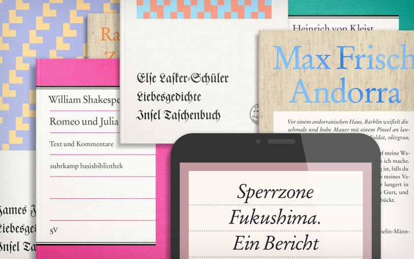
KI: The Project Suhrkamp cover designs don’t use imagery, and instead use “content-related colour schemes and patterns, or even with the book’s actual first page of text set on the cover.” Could you give some examples of how you chose colors or patterns for specific titles?
HV: For the series “Insel Taschenbuch Liebesgedichte” (above) for example, which are collections of love poems by various authors, I abolished the author portraits and instead introduced a series of very simple patterns—which are borrowed from traditional ways of weaving (twill bindings) and metaphoricially show the intertwining (i.e. interweaving) of two individuals/lovers.

Another example would be the series “suhrkamp taschenbuch” (above): Here, for instance, the type size of the author’s name and the book’s title (both foil-stamped onto a rough, natural linen cloth) are defined by the length of the longest line—which in turn defines the height of the text that starts on the covers already and leads inside the book. These covers are thus content-related insofar as their layout is determined by the actual length of their titles and author names.

KI: What was your design thinking when it came to typography? Was the typography similarly related to content?
HV: As for the typography (in terms of choice of typefaces), my aim was to establish a tie to the above-mentioned designs by Fleckhaus—as the whole project is also a reverence to his work—and to use typefaces traditionally associated with the publisher, such as a specific Garamond variant (as seen in my versions of “Basisbibliothek,” “Basisbiographien” (above), and “Studienbibliothek” (below) for example).

KI: Some of the pictures in the gallery show the books at a size and angle where the texture of the book covers becomes a focus of the picture. What role did texture and material have in this project?
HV: Materiality plays a crucial role in my opinion, because a book is not simply a text (or a somewhat random form of neutral content), but an actual object, an artifact that is explored not only with the eyes, but with almost all senses really (except for tasting maybe): we hear the sound of the pages as we turn them, we feel the different qualities of papers, the weight, and then there is, of course, the smell. There are many decisions to be made, material-wise: Does this book or this series need a rough uncolored cloth, a glossy cardboard, or a subtly embossed textile-like paper?

KI: The gallery includes images of book covers on tablets. What was the thinking behind the inclusion of ebooks in this project, and did ebook cover design require any special consideration?
HV: For “edition suhrkamp digital” (above), a relatively new series with (from a design perspective) rather questionable covers, I decided to translate key elements of the original print series (think centered typography and horizontal lines for structure, as in “edition suhrkamp”) but then add functionalities to it that honour the digital format, such as elastic/fluid layouts and responsiveness, or a night mode with inverted colors for reading in dark spaces (below).

KI: What advice would you give to students studying book design?
HV: Whenever I’m asked something like this I usually reply with what one of my professors once told me: Be like a sponge, absorb everything. As simple as that sounds, it is really wise in a way. Also, read a lot; study completely different things; collaborate; make the books you wish to see in the world.

Hagen Verleger is an independent Berlin-based graphic designer, editor, and researcher working mainly for artists, cultural institutions, and publishing houses. His main focus is on book design, typography, and editorial design. In addition to client work, his self-initiated design and research work centers around topics such as authorship in design, metaphors of the human memory (especially the palimpsest), and ephemeral typography. Hagen is founder and editor of the publication series “A Magazine About.” He is currently a guest researcher at the Dutch postgraduate institute Jan van Eyck Academie in Maastricht, The Netherlands, and is working on a PhD project in the fields of philosophy and media studies.