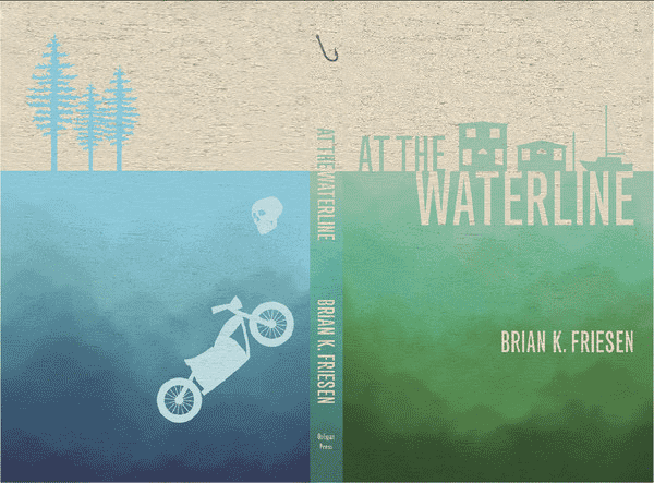
As I stare at the cover of At the Waterline it makes me want to read the novel again, or at least makes me wish I had seen the cover design first. I read the novel as a PDF document before the cover was developed. It’s remarkable how much a book’s cover can affect the reading experience; if I had seen the cover first, my expectations of the story would have differed greatly—from standard nonfiction to mysterious death and drama.
I’ve always judged a book by its cover even though the saying tells you not to, and I doubt that anyone would completely dismiss the cover when deciding whether to read a book. After researching some cover trends both today and in recent years, I wondered how well At the Waterline stands against today’s market trends.
According to Thomas McGee, two main principles are keeping it simple and making sure that the cover conveys the content of the book in a compelling way. The growth of online retail has greatly influenced covers to become more simplistic in their designs. They need to be identifiable at the “thumbnail size” due to the smaller screen allowance of some websites.
I compiled a list of cover trends and broke them down into the following categories:
- Symbolic and simple: A cover with one object as a focus or just text. Graphics or outlines replace more realistic photographic images.
- Typographical focus: This is something that seems to change depending on the genre, author, and a few other factors. Titles using this design element either make the text large and bold, or “uneven, yet balanced,” (McGee). The text in many cases “doubles as the title and imagery” like in At the Waterline.
- Illustrations: Illustrations are leaning toward a “pattern-oriented design” (McGee) and becoming more symbolistic.
- Color: Limited color palette and a lot of contrast on book covers have become more popular to make books stand out.
Next, on the website RightlyDesigned, McGee also identifies genre trends as an effect of a singular book’s popularity. To put it another way, when a book has risen above the others of its genre, it sets the trend of what is in style. As a sidenote, genre trends also occur because often the covers were made to target a specific audience, so genre trends are also genre signals, which is why I’ve separated genre trends from the list above.
Genre trends and Branding
- Faces of big name authors and celebrities. Their names might also be larger than the title since they are what draws in readers. Another instance when faces are used is in the memoir/(auto)biography genres.
- Eyes or head/body part cut off on the cover for the drama, mystery, and romance genres.
- Portraits/From the back image of character “to place you ‘alongside’ the book’s character” (McGee), or narrator in the case of the memoir/(auto)biography genres.
- Human silhouettes are found in many mystery genres.
- Bonneted woman are on Christian/Amish books.
- Lens flares or lights of some kind appear in the Christian genre.
- Borders are “a classic, fitting, historical look and feel” (McGee).
- White backgrounds are often found in the self-help genre.
- Handwritten typography is popular in the teen and young adult genre.
- San-serif fonts indicate modern, futuristic, and self-help books.
- Serif fonts indicate serious and historical genres.
Speaking further on genre trends, Tim Kreider informs readers of the line between genre fiction and other literature.
For some reason children’s books, Y.A. literature, and genre fiction still have license to beguile their readers with gorgeous cover illustration, but mature readers aren’t supposed to require such enticements. For serious literature to pander to us with cosmetic allurements would be somehow tacky, uncool. The more important a book is, the less likely there is to be anything at all on its cover.
So how does At the Waterline compare? Does the cover image fall on the correct side of the line to be considered literature, yet still entice? The cover of At the Waterline is simplistic. Again, the title doubles as text and imagery; its play on the the words At the Waterline is symbolic as well. The word “Waterline” looks like it’s a buoy keeping the houseboats in place. The text is uneven due to the split of the title, with half above the water and half below. It also has a san-serif font, which signals the modern setting of the novel, and a limited cover palette with contrast. Lastly, the images are graphic outlines rather than a realistic photo.

