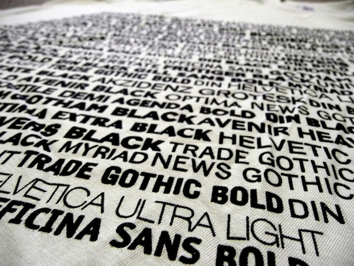
The Psychology Behind Serif and Sans-Serif Fonts

When was the last time you found yourself admiring that bold headline or subhead? Or that crisp body copy and well-formatted caption? The truth is that most people rarely consider the typefaces they are bombarded with on a daily basis. This statement is not intended as a negative commentary on people’s reading habits: well-executed typographic design should be invisible to the reader. Yet it’s nearly impossible to ignore when a typographic faux pas occurs.
To our horror, we’ve all come across that document rendered in Comic Sans, or the occasional headline struck in three fonts and four colors. But why do we recognize these design choices as visual transgressions? Is there something in our brains that decides how language should be represented on a page? As it turns out, there is a science behind typography that dictates and influences our psychology and, to some extent, even our physiology. To understand how typography can influence us, we must examine the most commonly used forms of typefaces and what they represent.

The two font types we will explore are serif and sans serif. These forms have a unique look and feel that can influence the way a reader views content. According to contentgroup in the article “The Psychology of Typography,” serif fonts represent the idea of “authority, tradition, respect, and grandeur.” Some of the most used serif typefaces include Times New Roman, Baskerville, Caslon, and Garamond.

blue baskerville garamond times adobe caslon

Some of the most popular serif fonts.

Serif fonts can be seen in many of the brands we recognize today, from Time magazine to The Gap and even the New York Times. For many readers, whether they know it or not, serif fonts convey dependability, perhaps because serif fonts are recognized as the traditionally stylized lettering most used in books. The shapes of the letterforms are flowing and designed to guide the eye to maximize readability and reduce eye strain.

Sans-serif fonts, on the other hand, behave differently from the more traditional serif letterforms. Headlines and subheads that rely on bold, clear messaging benefit from sans-serif fonts more than from serif fonts. Some of the more popular sans-serif fonts include Helvetica, Arial, Futura, and Proxima Nova. Like serif fonts, sans-serif fonts also are able to influence viewers. According to Joe Rinaldi, a UX designer at Impact, “sans-serif fonts give off a feeling of being casual, informal, friendly, and very approachable. Companies who want their brands to appear more youthful and relatable tend to use sans-serif fonts.” Companies such as Apple, Microsoft, Nike, and Netflix all utilize sans-serif fonts in their branding.

blue arial helvetica futura proxima nova

Some of the most popular sans-serif fonts.

There are a lot of arguments out there that try to establish that one typeface is inherently better than the other. Traditionalists value the more conservative, classic sense of structure and reliability that the serif font brings to a design. On the other hand, those who favor a more modern aesthetic use sans-serif fonts to convey a sense of friendliness and informality. The truth is there is no one solution. From a design perspective, however, I would argue that the answer lies somewhere in the middle. There will always be design scenarios that will call for one typeface or the other—or, more likely, both. What’s most important for the designer, however, is to know what emotional appeal they want to highlight and then to apply the correct typeface solution that will help influence viewers.

Typefaces as a Soft Science: How They Affect Our Perception of Information

Think about the last sign, book, or document you read. Did you like the content? Was it engaging? How did you feel after reading the material? Although you may not even realize it, the typeface of the content you read greatly impacts not only your comprehension of the material but also your mood. Typography exists all around us, but its effects can be very subtle and are often dependent on our society and culture.

Many of us associate certain typefaces with specific situations or ideas—Times New Roman is generally used for anything academic or professional, Courier is reminiscent of old typewriters, and Blackletter or Gothic script makes us think of newspapers. Aside from our personal connections with typefaces, other factors that influence our response to written material include the size of letters, how many words occupy a line, the spacing of characters, and the overall layout of a typeface and design.

It might seem strange to connect typography to science, but a psychological study published by Kevin Larson in 2007 demonstrated the relationship between design and comprehension. He discovered an adverse reaction in participants who studied a poorly designed document with an oversized header font and an image placed in the center of the body text. The participants who studied a nicely organized document with proportional typefaces felt more in control of their experience. None of the nine participants who read the poorly designed document were able to correctly solve a subsequent logic puzzle. This contrasts with the 40 percent of the participants who read the cleanly designed document and successfully completed the puzzle.

Web designer Phil Renaud provides us with another example demonstrating how typeface preferences are connected to our societal surroundings. On his blog in 2006, Renaud shared his personal experiences with choosing the right typeface. Shockingly, he revealed that the grades he received on college essays varied depending on what typeface he used. On average, essays written in Georgia awarded him an A, Times New Roman granted him an A-, and Trebuchet MS gave him a B. And while his grades may not have been entirely based on the various typefaces, his anecdote opens up the possibility of typeface biases among readers.

An article by Adrienne Wolter details another important experiment on the effects of fonts. In 2007, New York Times columnist Errol Morris created the quiz “Are You an Optimist or a Pessimist?” in which he wrote about asteroids that barely miss the earth, and highlighted physicist David Deutsch, who explained “why humans of our era are better prepared than ever to defend ourselves from destruction by asteroid.” The excerpt from Deutsch was randomly displayed in one of six different typefaces: Baskerville, Comic Sans, Computer Modern, Georgia, Helvetica, and Trebuchet. At the end of the article, Morris included a quiz asking readers if they shared Deutsch’s beliefs. And if they did, they were asked how strongly they agreed.

Baskerville had the strongest effect on readers who agreed with Deutsch’s statement, whereas Comic Sans persuaded the fewest number of readers, followed by Helvetica. Unsurprisingly, Baskerville’s clean design subconsciously prompted readers to find more credibility in the statement, while the sans serif informality of Helvetica and Comic Sans was not as convincing.

So what can we learn from these typographic experiments?

It’s important to remember that while typefaces are ubiquitous, we may not realize how vigorously our brains associate certain letterforms with specific contexts. Whether you’re a designer creating a dynamic book cover, or simply a thoughtful consumer, be mindful that every typographical choice has an impact on what we read.