
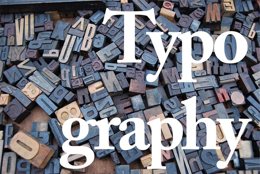
When was the last time you found yourself admiring that bold headline or subhead? Or that crisp body copy and well-formatted caption? The truth is that most people rarely consider the typefaces they are bombarded with on a daily basis. This statement is not intended as a negative commentary on people’s reading habits: well-executed typographic design should be invisible to the reader. Yet it’s nearly impossible to ignore when a typographic faux pas occurs.
To our horror, we’ve all come across that document rendered in Comic Sans, or the occasional headline struck in three fonts and four colors. But why do we recognize these design choices as visual transgressions? Is there something in our brains that decides how language should be represented on a page? As it turns out, there is a science behind typography that dictates and influences our psychology and, to some extent, even our physiology. To understand how typography can influence us, we must examine the most commonly used forms of typefaces and what they represent.
The two font types we will explore are serif and sans serif. These forms have a unique look and feel that can influence the way a reader views content. According to contentgroup in the article “The Psychology of Typography,” serif fonts represent the idea of “authority, tradition, respect, and grandeur.” Some of the most used serif typefaces include Times New Roman, Baskerville, Caslon, and Garamond.

Some of the most popular serif fonts.
Serif fonts can be seen in many of the brands we recognize today, from Time magazine to The Gap and even the New York Times. For many readers, whether they know it or not, serif fonts convey dependability, perhaps because serif fonts are recognized as the traditionally stylized lettering most used in books. The shapes of the letterforms are flowing and designed to guide the eye to maximize readability and reduce eye strain.
Sans-serif fonts, on the other hand, behave differently from the more traditional serif letterforms. Headlines and subheads that rely on bold, clear messaging benefit from sans-serif fonts more than from serif fonts. Some of the more popular sans-serif fonts include Helvetica, Arial, Futura, and Proxima Nova. Like serif fonts, sans-serif fonts also are able to influence viewers. According to Joe Rinaldi, a UX designer at Impact, “sans-serif fonts give off a feeling of being casual, informal, friendly, and very approachable. Companies who want their brands to appear more youthful and relatable tend to use sans-serif fonts.” Companies such as Apple, Microsoft, Nike, and Netflix all utilize sans-serif fonts in their branding.

Some of the most popular sans-serif fonts.
There are a lot of arguments out there that try to establish that one typeface is inherently better than the other. Traditionalists value the more conservative, classic sense of structure and reliability that the serif font brings to a design. On the other hand, those who favor a more modern aesthetic use sans-serif fonts to convey a sense of friendliness and informality. The truth is there is no one solution. From a design perspective, however, I would argue that the answer lies somewhere in the middle. There will always be design scenarios that will call for one typeface or the other—or, more likely, both. What’s most important for the designer, however, is to know what emotional appeal they want to highlight and then to apply the correct typeface solution that will help influence viewers.
David Henry
Way Cool! What a classic and informative article. You explain very well about serif and sans serif typefaces. I really appreciate your struggle. Keep up the great work.
Thanks a lot.
David Henry
Way Cool! What a classic and informative article. You explain very well about serif and sans serif typefaces. I really appreciate your struggle. Keep up the great work.
Thanks a lot.
ooliganpress
Thanks David! Glad you enjoyed it.
ooliganpress
Thanks David! Glad you enjoyed it.