
Think about the last sign, book, or document you read. Did you like the content? Was it engaging? How did you feel after reading the material? Although you may not even realize it, the typeface of the content you read greatly impacts not only your comprehension of the material but also your mood. Typography exists all around us, but its effects can be very subtle and are often dependent on our society and culture.
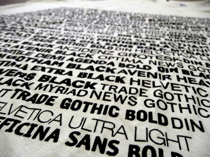
Many of us associate certain typefaces with specific situations or ideas—Times New Roman is generally used for anything academic or professional, Courier is reminiscent of old typewriters, and Blackletter or Gothic script makes us think of newspapers. Aside from our personal connections with typefaces, other factors that influence our response to written material include the size of letters, how many words occupy a line, the spacing of characters, and the overall layout of a typeface and design.
It might seem strange to connect typography to science, but a psychological study published by Kevin Larson in 2007 demonstrated the relationship between design and comprehension. He discovered an adverse reaction in participants who studied a poorly designed document with an oversized header font and an image placed in the center of the body text. The participants who studied a nicely organized document with proportional typefaces felt more in control of their experience. None of the nine participants who read the poorly designed document were able to correctly solve a subsequent logic puzzle. This contrasts with the 40 percent of the participants who read the cleanly designed document and successfully completed the puzzle.
Web designer Phil Renaud provides us with another example demonstrating how typeface preferences are connected to our societal surroundings. On his blog in 2006, Renaud shared his personal experiences with choosing the right typeface. Shockingly, he revealed that the grades he received on college essays varied depending on what typeface he used. On average, essays written in Georgia awarded him an A, Times New Roman granted him an A-, and Trebuchet MS gave him a B. And while his grades may not have been entirely based on the various typefaces, his anecdote opens up the possibility of typeface biases among readers.
An article by Adrienne Wolter details another important experiment on the effects of fonts. In 2007, New York Times columnist Errol Morris created the quiz “Are You an Optimist or a Pessimist?” in which he wrote about asteroids that barely miss the earth, and highlighted physicist David Deutsch, who explained “why humans of our era are better prepared than ever to defend ourselves from destruction by asteroid.” The excerpt from Deutsch was randomly displayed in one of six different typefaces: Baskerville, Comic Sans, Computer Modern, Georgia, Helvetica, and Trebuchet. At the end of the article, Morris included a quiz asking readers if they shared Deutsch’s beliefs. And if they did, they were asked how strongly they agreed.
Baskerville had the strongest effect on readers who agreed with Deutsch’s statement, whereas Comic Sans persuaded the fewest number of readers, followed by Helvetica. Unsurprisingly, Baskerville’s clean design subconsciously prompted readers to find more credibility in the statement, while the sans serif informality of Helvetica and Comic Sans was not as convincing.
So what can we learn from these typographic experiments?
It’s important to remember that while typefaces are ubiquitous, we may not realize how vigorously our brains associate certain letterforms with specific contexts. Whether you’re a designer creating a dynamic book cover, or simply a thoughtful consumer, be mindful that every typographical choice has an impact on what we read.