
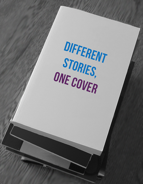
In the world of publishing, we know that a good cover design can go far in making a potential reader interested enough to pick up a book. Covers are the first things readers see, which means that they must convey everything about the story in one image (or collage of images). The eternal dilemma that designers face is how best to represent the themes, characters, plot, and mood of the work in a way that piques the reader’s interest. This is difficult enough when the work is only one story—add two more into the same title and the challenges increase.
Ooligan Press recently acquired a set of three short novels (to be published in one volume) called Three Sides Water, by Pacific Northwest–based author Peter Donahue. Each of the stories takes place in different time periods—1920s, 1960s, and present day—and each feature a different cast of characters. The only constants are the setting (all stories take place on the Olympic Peninsula of Washington) and the main theme of finding identity. We recently wrapped up the cover design process, through which we received many diverse and compelling concepts to solve this designer’s dilemma.
So what things can a designer do when faced with the challenge of representing three separate stories in one cover? Here are some tips:
Use the Cover Design Brief
This seems to be one of those “goes without saying” things, but it can never be overemphasized. At Ooligan Press, the cover design brief is put together by members of the project team after careful consideration of the type of cover that would fit the vision of the rest of the team. Included within the design brief are lists of key and minor visual elements from the works, main themes, and published examples of what to do and what not to do. Taking all of these things into consideration is the first step in creating your concept.
Pick a Direction (or Two) to Work With
Narrowing down your focus on the kind of cover you want to create does wonders for generating specific ideas. Once you know where you’d like your cover to go creatively, then you can figure out the how. A design brief might specify both illustrative and photographic directions as possibilities, and if you can decide on which one to put your energy into, you’ll be one step closer to putting the pieces together. (Of course, you can choose to do both.) Deciding to go in a more photographic direction would allow you focus on searching for the right photo, while choosing an illustrative approach would shift your focus into the style of illustration that you’ll be using.
Pick a Key Visual Element to Portray
Choosing a style of cover can also help in deciding what visuals you’ll be using to represent the works by allowing you to zero in on which visual elements will be done the most justice through your creative direction. For example, one of the key visual elements that appear in all three stories in Three Sides Water is the physical setting where they take place. If you, as the designer, decided to take a photographic direction, you could focus on the place element and search for the right photo of the setting. In the case of titles like Three Sides Water, it’s important to choose as few visual elements as possible to portray on the cover so that readers are not overwhelmed with images that could become confusing.
The main challenges that face a cover designer in any situation are how to make a cover that fits the genre, but not in a clichéd way, and to create something visually interesting and unique, but not so far from the norm of the genre that it doesn’t feel right to the reader. This is complicated when looking at not one, but three distinct stories that need to be represented on the cover. The unique challenge posed by this title has yielded interesting concepts, and the final cover reflects them beautifully.