
Every font can be used to elicit a response from the reader. We recognize it through our emotions and as we interact with the shapes and colors of the letters on the page. When creating a specific brand or when branding an idea, this concept can be incredibly powerful.
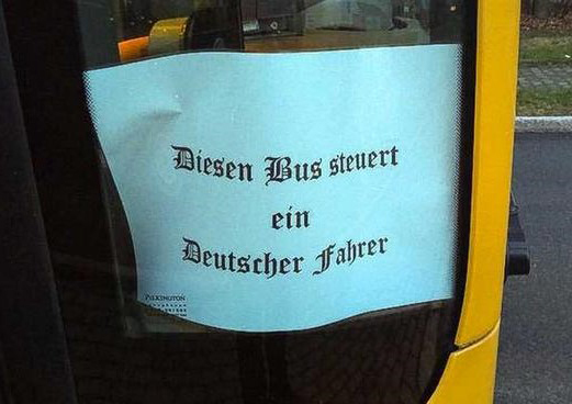
Let’s start with an extreme example. The Blackletter text of the Fraktur font will always be associated with the Nazi party. Hitler used the native German text as a way to unify people into a sense of nationalism because he understood that language could be used for manipulation. Once he had the support that he wanted, he flipped the switch and said the language had been corrupted throughout history by the Jewish people. He then used it as a way to justify the persecution and murder of innocent people. Though time has created distance, Fraktur text is instantly recognizable and associated with this specific ideology. The above picture was spotted on a bus door in September of 2019, in Dresden, Germany. It reads, “This bus is driven by a German driver.” There is no question as to what the sign means.
There is a pattern that oppressors use to weaponize language when they are creating their brands. It’s a familiar tactic that can be detected by a subtle or blatant switch in font and color in political propaganda. The signs that represent the ideology start out benign, with serifs or organic curves to suggest brotherhood, unity, and a concern for all. Then they shift to sans serif, bold, and blocky fonts to make the ideology stand out. The use of a bold sans serif in itself isn’t bad. In fact, for many years American politicians have used bold sans serifs to create their brands and capture the attention of voters. It’s the subtle changes and inconsistencies in their usage that can indicate that things are headed in a dangerous direction.
In light of what happened in our country on January 6 of this year, I think it’s fitting to look at the campaign posters of Donald Trump to see what kind of message he has been sending from the beginning. While it might be argued that this is just one biased opinion, remember that we don’t have to rely solely on what I glean from his posters; the former President has been very verbal about his agenda and has backed it up with his actions.

In his first campaign, there was little unification except for the box with the little stars that eventually became his logo. He changed his fonts and colors for every group that he pandered to. His slogan, “Make America Great Again,” was written with America as the main focus in a Century Schoolbook (serif) font; this large, non-threatening word served as his hook. The poster that bore his name was put in bold, and his slogan took up roughly the same amount of space. America was no longer the focus and had no special treatment, but there was also a pleasing amount of negative space, leaving the impression that there was room for others with Trump. Even though he appealed to the majority, there were warning signs. He started out humble-ish until he was elected.
His 2020 campaign tells a completely different story. He had to scrap the “Keep America Great” slogan because 2020 hadn’t been such a banner year, and not very many of his promises had come to fruition. His propaganda, however, would have you believe otherwise. His logo and name took up almost half of the space, and the margins were pushed out to maximize the overall space. Overblown, in-your-face, and loud Akzidenz Grotesk font screams, “Trump is the Greatest!” The poster bearing his VP’s name shows that Pence has been demoted along with America, and the red line between their names says that Trump won’t be sharing power with anyone.
Had the coup on January 6 succeeded, our country may have learned to associate this unfortunate font with a dictator, just as the Germans do with the Fraktur font. Trump made promises that he wouldn’t be the typical politician, and in regards to American politics, he was right. Though Trump used Akzidenz Grotesk font for his campaign, it is ambiguous enough to escape shame and may still have a future.