
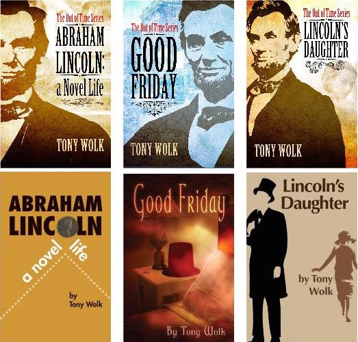
Your relationship with a book begins with your first glimpse at its cover. The cover tells a story and affects your decision to pick up the book or keep on walking. Cover designs—colors, lettering, imagery—are carefully crafted to attract a specific audience and evoke a particular feeling when seen for the first time. From time to time, old books go through redesigns—primarily a marketing tool, a new cover is created to grab new readers or to update outdated designs. In the case of the design team at Ooligan Press, they have been hard at work redesigning ebook covers for the “time-twisting” trilogy Lincoln Out of Time by Tony Wolk. Compare the old print covers and the new ebook covers above.
“The original print covers for the trilogy were designed between 2004 and 2009, and since then, the Adobe Creative Suite programs have become incredibly powerful tools,” Erika Schnatz, design lead at Ooligan Press, shared with me. She went on to explain that the press as a whole has matured since Lincoln out of Time was initially published, and a redesign of the ebook covers seemed necessary to create a unified look for all three books in the series.
Three student designers submitted their concepts for the Lincoln Out of Time redesign. Each week they shared the updated versions of their design concepts while other students gave input on likes and dislikes and offered suggestions on how to best visually represent the series. Corinne Gould said, “That’s why I am at Ooligan, and why I will keep submitting designs—the peer mentoring is such an amazing learning experience.” Another student, Brian Parker, agreed with this sentiment: “Everyone who contributes a design is part of the process and adds something to the conversation.” Once the design process was finished, Ooligan Press as a whole voted on the final design and presented it to the author.
The designers creating new covers for these ebooks were very aware that readers will first encounter the covers in thumbnail size. They needed to think “simple, small, and strategic,” as Joe Friedlander explains in his article “3 Secrets to e-Book Cover Design Success”: use simple images that read clearly in a small frame; the main focus is to capture the attention of those unsure of what they are looking for; create unity among series or author-related titles (especially appropriate for the Lincoln Out of Time trilogy).
Redesigns happen more often than you might think—publishers want in-print books to keep looking modern and remain appealing to their target audience. In this case, at Ooligan Press, the main goal was to create a unified look across the books in the trilogy and attract a new set of readers to the series. If you are interested in reading more about redesigns in the publishing world, check out this interview with Molly Leach.